
In our daily lives, we come across countless visuals: from app interfaces to magazine ads, from websites to billboards. Have you ever thought why some visuals are more appealing than others? Two crucial elements that play a significant role are color and typography. They’re like the salt and pepper of design: they may seem irrelevant, but they can either make or break the dish.
COLOR THEORY
Colors are for more than just ‘aesthetics’; they’re silent communicators of the visual world around us. Designers use the Color Theory to make their designs stand out and resonate with their viewers. Think of color theory like a guide book for mixing and matching colors. By understanding which colors work well together, designers can create visuals that are pleasing to the eye. The same way you wouldn’t throw random ingredients into a recipe, designers choose carefully which colors match with which to create a final product that grabs the viewer’s attention. They use color theory to ensure that their designs evoke the right emotions, grab attention, and deliver a clear message.
THE COLOR WHEEL

Designers often turn to the Color Wheel as their trusted guide when selecting shades for their designs. Picture a vibrant circle showcasing every color we can lay our eyes on. This wheel isn’t just a rainbow of hues; it’s a roadmap that helps designers pick color combinations that truly stand out. At the very core of this wheel, you’ll find the primary colors: red, yellow, and blue. These are like the original “parent” colors because you can’t make them by mixing others together. When you blend these primary colors, you get secondary colors like green (from blue and yellow), orange (from red and yellow), and purple (from red and blue). But the color magic doesn’t stop there. Mix a primary and the secondary next to it, and you get what’s called tertiary colors. Examples include yellow-green or red-orange. Understanding this wheel helps designers craft palettes that feel harmonious, balanced, and pleasing to our eyes.

Colors that are directly opposite to each other on the color wheel are called complementary colors. Think red and green, or purple and yellow. They create vibrant contrasts when placed right next to each other.
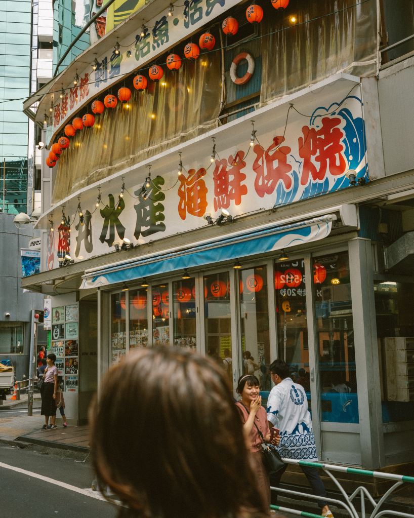
The picture on the left is a great example of a complementary color palette, since it contrasts the red from the green. Moving on, triads consist of a three-color combination, equally spaced around the color wheel. Classic examples include the primary colors (red, blue, yellow) or the secondary colors (green, orange, purple). Analogous Colors are neighbors on the color wheel. They harmonize well and give designs a certain cohesive feel. Think of blues and greens or reds and oranges. Finally, monochromatic colors are various shades and tints of a single color. It’s subtle and can create depth without overwhelming with too many hues. Each color holds emotion. For instance, green can mean growth, freshness, or envy, depending on its context and shade. Using the correct colors will improve your design drastically.
TYPOGRAPHY
Typography is like the voice of a design. Just as the tone of someone’s voice can change how we feel about what they’re saying, the way text looks can shape our reaction to a certain message. Designers use typography to make sure their designs are readable and to set the mood. Whether it’s a fun, wavy font for a kid’s birthday card or a strong, bold typeface for a movie poster, the choice of typography can make all the difference. It’s not just about picking a “pretty” font; it’s about choosing the right voice to fit the message. In short, good typography ensures that a design not only looks good but also communicates clearly and effectively.
To start off, kerning refers to the space between individual letters. Proper kerning ensures that letters don’t feel squished or too far apart. Another important part are dashes, and not all dashes are created equal. There’s the en-dash (–) and the longer em-dash (—). They can break up sentences or emphasize a point. Underlining in design can sometimes confuse, making users think text is clickable. It’s used sparingly in modern design. Symbols like ©, ™, &, *, are special characters, they more add flavor and specific meanings to text. They’re like the seasoning in a dish. Proper use of quotation marks ensures clarity. And in design, there’s a choice between straight “quotes” and curly “quotes,” with the latter being more typographically traditional. Proper typography in a design will make it look 10x more professional and more appealing to the viewer.
ANALYZING DESIGN
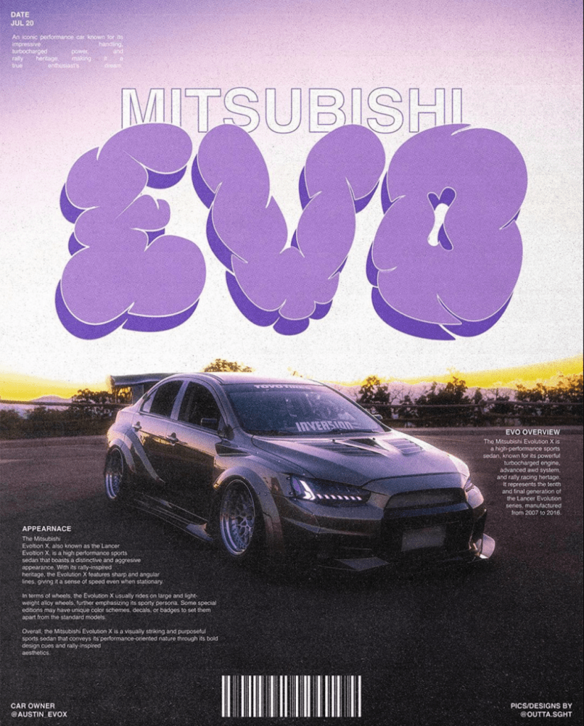
When you apply all of these principles together, you get a design like this. Note the vibe that you get from looking at it. It follows an almost fully purple monochromatic color palette that makes the whole design stand out. The fonts used here are catchy, and they all match, making it pleasing to view. It follows mostly all the principles of the Joshua Tree Epiphany, like alignment of text, the contrast between the text and the background, and the repetition of the color purple. Overall, this is a really well-made design, and a great example of a professional one as well. This could easily be used as a cover of a very important magazine, which I’m assuming is what the creator went for. It still is a perfect example of a design that follows all the rules mentioned.
Featured Image: Julie Fader on Unsplash; edited by Juan Castillo
