10 – WEBSITES TO USE FOR STOCK VIDEO FOOTAGE

Today, let’s talk about stock video footage. If you’re not familiar, stock footage is basically short video clips filmed by videographers, or anyone in general, and uploaded to websites for anyone to buy or download. Sometimes it’s extra footage from bigger projects, and other times it’s shot specifically to sell. Designers love it because it’s super versatile—perfect for B-roll (supplemental videos or clips), video backgrounds, ads, social media, or YouTube content. It’s like a goldmine of visuals to make your projects shine.

WHERE TO FIND FOOTAGE?

Now, let’s get to the fun part—helping you find the best free stock video websites out there. No annoying download limits or watermarks, just high-quality clips ready to use.

#1 – COVERR


Coverr is a gem for free stock videos, offering hundreds of high-quality clips perfect for marketing, branding, or just spicing up your content. The best part? No watermarks, no attribution required, and downloading is a breeze—you’ll get a ZIP file with your video and a handy JPG thumbnail. It’s a no-brainer for anyone looking for hassle-free footage.

#2 – VIDEVO

Videvo is another fantastic option, offering free stock videos for both commercial and non-commercial use. While some clips require attribution (and others come with watermarks), they also have premium plans if you need more flexibility. Their free library includes 30-second clips without watermarks, making it a solid choice for quick projects.

#3 – MOTION ELEMENTS

Motion Elements is a great resource for high-resolution stock videos, all free for commercial and non-commercial use. The only catch? You’ll need to sign up to download, but it’s totally free and lets you grab 5 videos per week. Plus, if you share the site with a friend, that limit jumps to 30 downloads per week, which is a great deal.

#4 – MIXKIT

Mixkit is the real MVP of free stock video websites. No sign-ups, no watermarks, no attribution required—just pure, high-quality footage ready for both commercial and non-commercial use. Their library is packed with a wide variety of clips, from tech and fashion to travel and beyond. It’s as free as it gets, and we’re here for it.

#5 – VIDEEZY

Videezy is one of the largest video communities out there, offering a massive collection of free stock videos. While most of their content is free (with attribution for commercial use), they also have a premium tier, Videezy Pro, for access to even more high-quality clips. Prices start at $19 per file, but their free library is still a goldmine for creators on a budget.

CREATIVE COMMON LICENSE AND ITS USAGE

Before you go start creating amazing videos with free stock footage, there’s something very important you need to understand: usage rights and Creative Commons licenses.

Basically, Creative Commons, or CC, is a nonprofit organization, and they give free licenses for creators to share their work with specific permissions. These licenses let the creators (those who made or recorded the footage) decide how others can use their work. Whether it’s for commercial use or just personal projects, they can still keep some of those rights for themselves.

Now, not all CC licenses are the same. Some allow you to use the footage commercially and tweak it however you want, while others might restrict that. Because of that, it’s essential to check the specifics of the license before using any stock footage. Always double-check if you need to give credit or if there are any other rules you need to follow. You don’t want to accidentally break those rules, so read the details carefully.

CONCLUSION

And there you have it, your basic guide to free stock video footage. From discovering top websites like Coverr, Videvo, Motion Elements, Mixkit, and Videezy to understanding Creative Commons licenses, you’re all set to elevate your projects. Just remember to always check the license details to ensure you’re using the footage legally and ethically. With these resources and a bit of creativity, your next video project is bound to stand out.

Photo by mos design on Unsplash

APP & WEBSITE WIREFRAMING PROCESS

Today we explore the realm of wireframing, addressing how to wireframe an app or website, highlighting its significance, what it helps accomplish, and why designers emphasize this step.

Wireframing plays a crucial role in website or app design, serving as a blueprint to map out structure and functionality before diving into detailed design or development. This process aids designers in visualizing layout, content placement, and interactions clearly, fostering effective communication and collaboration within their teams.

SO WHAT’S WIREFRAMING?

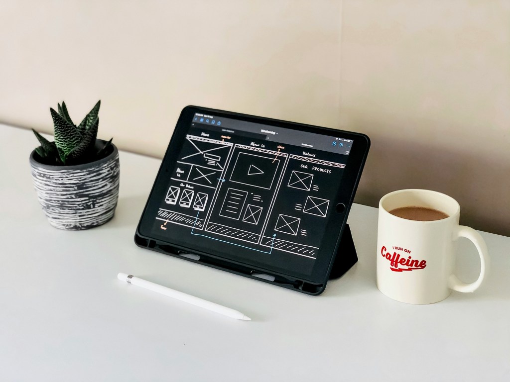
Wireframing involves developing a basic visual depiction of a website or app’s interface. Typically monochromatic, wireframes are basic diagrams or sketches illustrating the arrangement of elements on screens or pages, including headers, footers, navigation menus, content sections, and interactive components like buttons and forms. Emphasizing functionality and structure, wireframes skip design elements like colors, typography, or intricate graphics.

Photo by Kelly Sikkema on Unsplash

WHY WIREFRAME?

Photo by Visual Design on Unsplash
Wireframing enables designers to transform abstract concepts into useful visual representations. It offers a visual interpretation of the initial ideas, enabling team members to grasp and discuss the proposed structure and functionality effectively.

Establishing Layout and Structure:
– By prioritizing layout and structure over design elements, wireframes guarantee the inclusion and proper arrangement of all essential components. This phase aids in structuring content hierarchies and user pathways, ensuring easy access to crucial information and features.

Facilitating Collaboration and Communication:
– Wireframes serve as a universal language among designers, developers, stakeholders, and clients. They provide a visual tool that is easily comprehensible and open for discussion, promoting clear communication and minimizing misinterpretations.

WHAT DOES IT HELP ACHIEVE?

Detecting Usability Challenges:

– Wireframing enables the early evaluation of user pathways and interactions. By charting the user’s journey within the site or app, designers can pinpoint possible usability issues and implement required adjustments.

Efficient Resource Management:

– Rectifying layout and functionality issues during the wireframing phase proves more time-effective than making modifications in subsequent design or development stages. Wireframes offer a swift and cost-efficient means of enhancement, allowing for refinements without significant resource allocation.

Emphasizing Content and Features:

– Wireframing assists in prioritizing content and features based on their significance and alignment with user requirements. Through visual layout representations, designers can ensure vital information and functions are prominently displayed, while less crucial elements are suitably positioned.

Photo by Kelly Sikkema on Unsplash
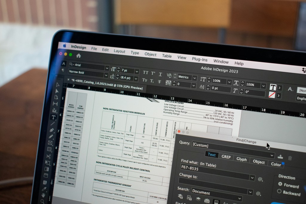
Photo by pan zhen on Unsplash; Edited by Juan Castillo

UI & UX DESIGN + JOBS IN THE FIELD

Let’s dive into the world of UI/UX design, discover the importance of A/B testing, and explore local job opportunities in these dynamic fields, offering exciting career paths in digital design.

UI/UX DESIGN

Photo by Alvaro Reyes on Unsplash
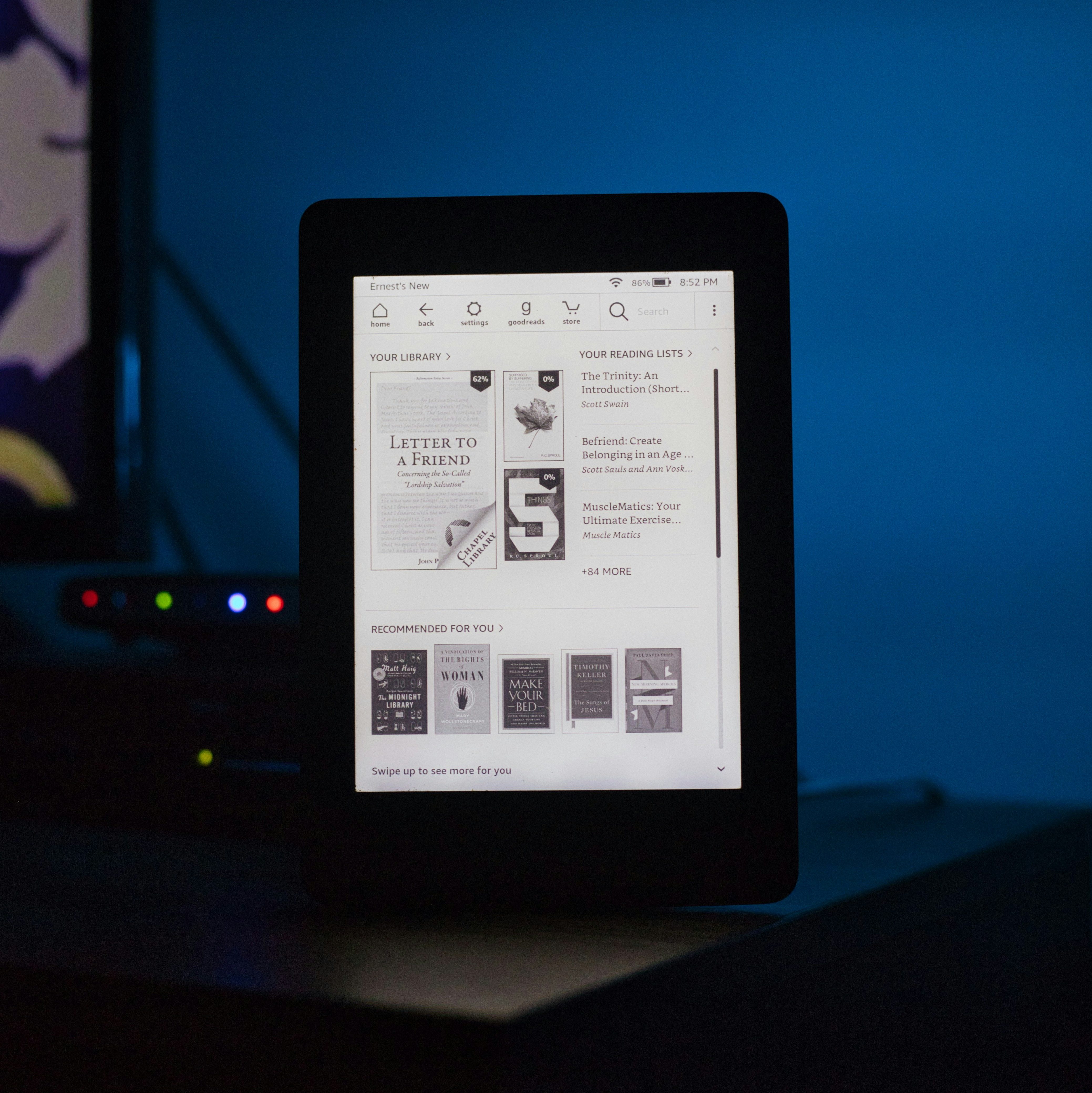
In the realm of UI/UX design, we delve into the core concepts of User Interface (UI) and User Experience (UX). UI encompasses elements like screens, buttons, icons that users interact with on websites or apps, while UX covers the overall interaction and user feelings towards a product. Although UI can influence UX, they have distinct roles. For instance, a visually appealing banking app with poor loading times affects user experience negatively. UX designers focus on user pathways and wireframes, while UI designers handle visual aesthetics and mockups. UX designers conduct user testing, identify problems, and collaborate with stakeholders, UI designers, and developers. On the other hand, UI designers work closely with developers to implement designs effectively into a working product.

A/B TESTING

Photo by Alvaro Reyes on Unsplash

To grasp the essence of A/B testing, let’s break down its simple meaning and fundamentals. A/B testing, also called split testing or bucket testing, involves comparing the performance of two versions of an app or webpage to determine which one resonates more with visitors. This method empowers designers to make informed decisions based on actual data rather than guesswork. By testing a control version (A) against a different version (B), you can evaluate which one achieves greater success based on your key metrics. Implementing A/B testing can help address visitor pain points, enhance ROI from existing traffic, decrease bounce rates, make low-risk modifications, achieve statistically significant improvements, and optimize websites/apps for future gains.

Through A/B testing, you can evaluate various elements such as headlines, body content, subject lines, design, navigation, forms, call-to-actions, social proof, and content depth. There are four primary testing methods: A/B testing, Split URL testing, Multivariate testing, and Multipage testing. Split URL testing involves testing a completely new website form, Multipage testing tests specific elements across multiple pages, and Multivariate testing simultaneously tests variations of multiple page variables to determine the most effective combinations.

LOCAL JOBS

Photo by rivage on Unsplash

– Multimedia Producer at the University of South Florida, full-time hybrid work role situated in Tampa, FL with an annual salary range of $50,000 to $60,000.
– Multimedia Associate at the City of Palm Coast, full-time job based in Palm Coast, FL with an annual salary ranging from $53,259 to $66,300.
– Director of Music & Performance Content at South Florida PBS, full-time position in Boynton Beach, FL, offering an annual salary range of $80,000 to $90,000.
– Writer at LRP Media Group, full-time role in Palm Beach Gardens, FL, with a variable pay scale.

Additional related job roles that you may consider exploring:

– Social Media Manager

– Graphic Designer

– Video Editor

– Content Strategist

– Web Developer

– Digital Marketing Specialist

– Art Director

– User Experience (UX) Designer

– Motion Graphics Designer

– Creative Director

Photo by pan zhen on Unsplash; Edited by Juan Castillo

WEBPAGE SIZE OPTIMIZATION & WEB DESIGN

Building a website is tough, but making one that works well and loads fast can be tricky, especially if you’re not familiar with optimizing websites. Let’s understand why the size of your webpages matters—it affects how quickly they load, how users experience your site, and how well you rank on search engines. Once you see why it’s important to keep your pages small for a speedy and smooth website, you can start making the necessary improvements. We’ll also discuss when to use different types of files like GIF, JPG, and PNG in web design and explain why they matter.

Page Size Optimization

Photo by Benjamin Dada on Unsplash

In web design, page size refers to how big a webpage is with all its elements like images, scripts, and stylesheets. Smaller pages load faster and work more efficiently, giving users a better experience, especially on slower internet connections. This is crucial for managing virtual memory because smaller pages use memory more effectively, reducing waste but increasing overhead. On the other hand, larger pages can reduce overhead but lead to wasted space. Simply put, smaller pages load quicker as they need less data to travel over the internet, which also boosts search engine rankings as they prefer faster-loading sites. Having large pages can slow down loading times, making visitors leave your site, straining server resources, and increasing hosting costs.

Now that we know smaller page sizes improve website performance, here are some tips to reduce your page file size:

– Reduce unnecessary plugins/scripts: Regularly review and remove unnecessary plugins/scripts to enhance website security.

– Compress files: Tools like Gzip can compress files by up to 70%.

– Minimize HTTP Requests: Combine CSS and JavaScript files, use sprites instead of individual images, and lower the number of redirects.

– Use Content Delivery Networks (CDNs): CDNs distribute content across multiple servers, easing the load on your web server and handling high traffic efficiently.

– Minify CSS, JavaScript, and HTML: Remove unnecessary characters like white spaces to reduce file size without affecting functionality.

– Optimize fonts: Subset, compress, and choose the best font format to reduce space taken up by custom fonts on your website.

– Optimize images: Use image compression software to lower file sizes while preserving quality.

– Use Lazy Loading: Load only visible images and videos in the user’s viewport to boost performance.

JPG, PNG, & GIF

When selecting image file formats like JPG, PNG, & GIF each has its advantages. JPG strikes a balance between quality and size, GIF is great for animations and transparency, and PNG excels for graphics. With JPG compression, you can adjust the ratio between 0-100% to find the right balance for your website. Typically, compressing an image between 75-100% retains its integrity and quality. PNGs were created to replace GIF due to licensing concerns, leading to their similar functions.

Photo by Ilya Pavlov on Unsplash
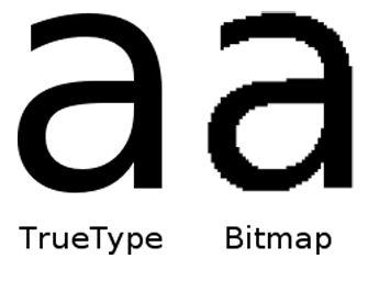
Photo by Karen Z on Unsplash; Edited by Juan Castillo

WEBSITE TARGET AUDIENCES

In the realm of branding and design, knowing who your website is speaking to is like holding the key to success. Your website’s target audience is not just a casual concept; it’s the heartbeat of your brand. But what exactly is a target audience? Simply put, it’s the specific group of individuals you aim to attract to buy your products or services. Imagine it as your own tribe, a community of people who will truly appreciate and benefit from what you have to offer. It’s time to leave behind the idea of trying to appeal to everyone, because, let’s face it, not everyone will be drawn to what you’re putting out there. Instead, focus on those who will find value in what you bring to the table.

THE WAY PRO’S DO IT

Photo by Brooke Cagle on Unsplash
Professionals in marketing and design utilize the tool of data, meticulously analyzing consumer engagements, studying buying patterns, and continuously adapting based on customer insights. They dive into demographics and psychographics to paint a vivid picture of their target audience, considering factors such as age, location, income, education, family status, occupation, and cultural background, alongside attitudes, values, interests, hobbies, and behaviors to understand consumer motivations deeply. To identify their core audience, professionals follow strategic steps like finding the customer base, conducting client interviews, performing market research, monitoring industry trends, analyzing competitors, crafting detailed personas, refining data, and utilizing tools like Google Analytics for valuable insights. Developing personas, enriched with details like age, gender, location, interests, income, education, profession, and media consumption habits, helps businesses understand their audience better by combining market research with client feedback. These personas guide companies in reaching their core audience effectively through media kits,, social media platforms, and third-party data, ensuring tailored strategies that resonate with the target demographic.

THE WAY DESIGN STRATEGIES HELP

Design strategy plays a pivotal role in maintaining a strong connection with your target audience. It balances customer value with business profitability, offering cost-effective solutions, providing clear direction, and aiding in goal prioritization. A well-crafted design strategy helps define your core audience, understand their expectations, and deliver products tailored to their needs, ensuring success in product launches and overall business objectives.

Photo by Lala Azizli on Unsplash

Photo by Emil Karlsson on Unsplash; Edited by Juan Castillo

ACA TESTING PROCESS

The ACA, an acronym for Adobe Certified Associate, represents a test accessible to all, with successful completion of a 70% or higher resulting in a certification that tests to one’s entry-level design proficiency in planning, creating, and having effective communications using a specific form of digital media. This certification serves as a valuable asset for pursuing careers within the multimedia and design sectors, demonstrating the capability of the user in navigating Adobe software, which is a ubiquitous tool within the design industry.

Photo by Christin Hume on Unsplash

MY TESTING EXPERIENCE

Throughout my design course, I have undertaken multiple ACAs encompassing various software applications such as Photoshop, Illustrator, and soon InDesign. My teacher gave us some resources to aid our learning and encouraged independent research to master these programs. Among these resources, Gmetrix, stood out by offering extensive training videos, quizzes, practice tests, and hands-on tutorials. Personally, I found Gmetrix to be the most beneficial resource for mastering Adobe software. I do not advocate solely relying on YouTube tutorials, as they may fill individuals with excessive information. Even experimenting with the software independently can make it easier to manage the software with the tools and their diverse applications.

To this day, I have successfully passed all my ACAs. In my view, the Illustrator ACA gave me the hardest challenge, making it harder than Photoshop, leading to frustration during the exam. Overall, the actual testing process is not overly tedious, and Certiport, the platform for the official assessments, offers user-friendly navigation and comprehensive instructions throughout. I strongly recommend investing time in mastering the software, particularly through the use of Gmetrix, which, as I mentioned earlier, offers easy to understand, step-by-step hands-on tutorials. Additionally, familiarizing yourself with as many shortcuts as possible optimizes efficiency within the 50-minute timeframe given for both the hands-on and multiple-choice sections, and proper time management, especially during the hands-on segments, is key to succeeding when taking these exams.

Photo by Mathew Schwartz on Unsplash; Edited by Juan Castillo

BRANDING & STYLE GUIDE PLAN

As a graphic designer, your journey involves connecting with brands and crafting their visual identity, a process that demands the creation of a stellar branding style guide. This essential tool showcases your expertise in the creative realm. But before going into the challenges of developing this guide, it’s crucial to understand what it entails and why it holds such significance. In simple terms, a branding style guide serves as a comprehensive rulebook, dictating every aspect of a brand’s visual representation, from preferred fonts to color palettes and logo usage. Establishing a well done style guide is key in ensuring that the work produced, whether for your own work or a collaborative project, gives consistency and excellence. Keep reading as I show you the art of crafting an appealing branding style guide and discover the impact it can have on your creative endeavors.

Photo by Kelly Sikkema on Unsplash
THE PLAN

Embarking on the journey of creating my branding style guide involves a tedious process of exploration and introspection. Before diving into the actual development, my first step is to go into extensive research to find the key attributes that define a truly exceptional branding guide. Throughout this process, I find myself thinking the fundamental question: “What sets my guide apart from generic templates readily available online, and why would someone choose to invest in mine?” Seeking inspiration and revisiting my past projects are integral components of this preparatory phase, allowing me to gain a fresh perspective on the overall vibe and aesthetic of my brand.
Undeniably, the thought of crafting an appealing guide presents a difficult challenge. The task of condensing all the necessary information into a visually appealing PDF document looks quite demanding. However, I am optimistic that once I start the actual building of the style guide, the process will gradually unfold with greater ease.
While I possess all the essential elements, the art lies in artfully arranging them within a PDF that is appealing to the viewer. Despite the anticipated challenges, I am eager to navigate this creative journey and witness the evolution of my branding style guide into a visually captivating and informative masterpiece.

MY INSPIRATION

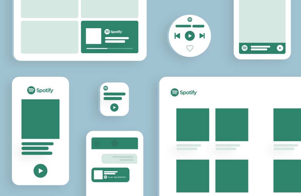
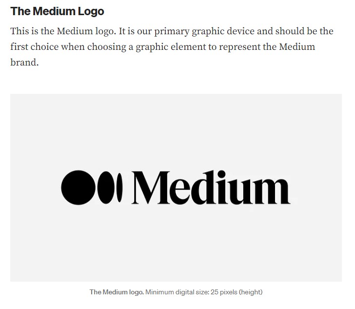
As I look for inspiration, I researched some of the brands that catch my eye when it comes to appealing logos and color palettes, and I found their respective branding guidelines for designers to use. These are great examples that dive into each and every element such as typography, logo placement, white space, and so much more.

#1 – STARBUCKS

#2 – MEDIUM

Photo by Medium Design

#3 – SPOTIFY

#4 – PARIS 2024

#5 – BARBICAN

Photo by Denys Nevozhai on Unsplash; Edited by Juan Castillo

INDESIGN TOOLS + EPUBS AND EBOOKS

If you’ve ever wondered what InDesign is all about, you’re in the right place. While Photoshop is awesome, InDesign opens up a whole new world of possibilities for designers, businesses, and publishers. From eye-catching flyers to stunning magazines, this powerful software does it all. Join us as we dive into the essential features of InDesign and learn how it brings ePubs and eBooks to life.

INDESIGN INTERFACE

Photo by Kelsey Todd on Unsplash

Typography is the unsung hero of design, and InDesign brings a treasure trove of typography tools to the table. With hundreds of fonts and the power to tweak kerning, dimensions, and style, InDesign lets you unleash your creativity and craft stunning custom typography. Its advanced features like kerning and ligatures elevate the visual appeal and readability of your text, making your designs truly stand out.

From the Character and Paragraph Panels to OpenType Features and Type Tools, InDesign offers a rich arsenal of typography tools. But that’s not all—its preflight panel is a game-changer, alerting you to potential printing or output issues before they become problems. By catching issues early on, InDesign gives you the control to perfect your design without last-minute panic or rework. Let’s dive into the world of typography with InDesign and unlock its full potential.

EPUBS

Photo by Kwame Anim on Unsplash

To delve deeper into InDesign, it’s essential to grasp the concepts of ePubs and eBooks and their unique advantages. An ePub, or electronic publication, is a versatile ebook file format designed to be read on digital devices, offering reflowable text and interactive elements like hyperlinks, videos, and audio. On the other hand, an eBook is a digital text format tailored for seamless reading on screens such as smartphones and computers.

EBOOKS

Photo by Spencer on Unsplash

In the realm of digital publishing, InDesign provides robust support for ePubs and eBooks, empowering designers to craft engaging, interactive documents accessible across diverse devices. Its specialized features, including the creation of tables of contents, bookmarks, and hyperlinks, streamline the process of eBook production. Moreover, InDesign goes even further by enabling the design of visually captivating fixed-layout eBooks, ensuring that the layout and design remain stunningly intact regardless of the device’s screen size.

Photo by Daniel Tseng on Unsplash; edited by Juan Castillo

FONT TYPES AND PCF REGULATIONS

Understanding the significance of fonts in graphic design is crucial, and it’s essential for designers to grasp the unique attributes of each font. This article dives into the disparities among TrueType, Postscript, and OpenType fonts, while also examining the regulations governing the proprietary copyright of fonts.

POSTSCRIPT FONT

Image by ASK Design

In 1984, Adobe introduced a new kind of font based on their postscript language, designed specifically for print publishing. These fonts, also known as Type 1 fonts, are generated from two files: a digital file with bitmap information for display, and an outline file for printing, resulting in more reliable output. Postscript also employs scalable font technology, allowing it to be encrypted and compressed, with “hints” that enhance text appearance at 300 dpi and lower. It is favored for its high-quality output and precision, although it can be more challenging to work with than TrueType due to the need for specialized software for editing.

TRUETYPE FONT

Image by Medium

In 1991, Microsoft and Apple wanted to use Type 1 fonts but didn’t want to pay Adobe. Instead, they worked together to create a new font and printing technology. Eventually, Apple developed TrueType. TrueType has two parts: the fonts themselves, which come in thousands of styles, and the rasterizer, a software built into Mac and Windows systems.

These parts are needed to show and print TrueType fonts on a computer, and how they work together determines how the font looks. TrueType is a scalable font that uses math to look like a vector. It became popular because it’s easy to use, looks great on screens, can be customized, and works on most operating systems.

OPENTYPE FONT

Image by Google Fonts

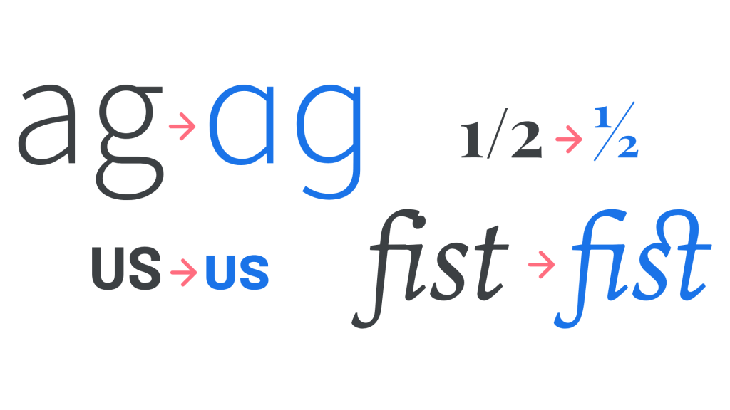
In 1997, Microsoft and Adobe aimed to expand Apple’s TrueType font format and created OpenType fonts. These fonts, like TrueType, are based on Unicode, a system for encoding various writing systems worldwide, allowing them to contain numerous characters and alphabets. OpenType fonts offer typographic enhancements like true small caps, diverse styles, extensive alternate characters, and sets of accented characters or diacritical marks.

The primary advantages of the OpenType font format lie in its scalability, compatibility, and support for extensive character sets from various languages.

RULES AND REGULATIONS

Image by Umberto on Unsplash

Now that you understand the differences and benefits of TrueType, Postscript, and OpenType fonts, let’s discuss the rules related to the ownership of fonts. To grasp these rules, it’s crucial to understand what copyright means. Copyright is the legal right of the owner of property (in simple terms, it’s the right to copy). Fonts are protected by copyright as long as they qualify as computer software or a program (most fonts fall into these categories), so the creator of the fonts has the right to control how their font is used and distributed.

Using a font without the proper license or permission from the creator, even for a small project, can be seen as copyright infringement, which may result in legal action and lawsuits. However, there’s good news: there are some font options that are free for personal use (like for a school project) but require a license for commercial use. Therefore, it’s crucial to ALWAYS check the license agreement of the font before using it in your design.

Photo by Ji Seongkwang on Unsplash; edited by Juan Castillo

CREATING ANIMATED LOGO ELEMENTS (STEPS)

I’m guessing the main reason you’re reading this article is to learn how to create an animated logo in Photoshop. Well, you’re in the right place. Animated logos can help the customer bond with the brand further, rather than having a plain and motionless icon. Having an iconic animation that your audience can recognize is crucial in order to form that connection, and today, you’ll learn how to do it by yourself.

STEP #1 – CREATE NEW DOCUMENT

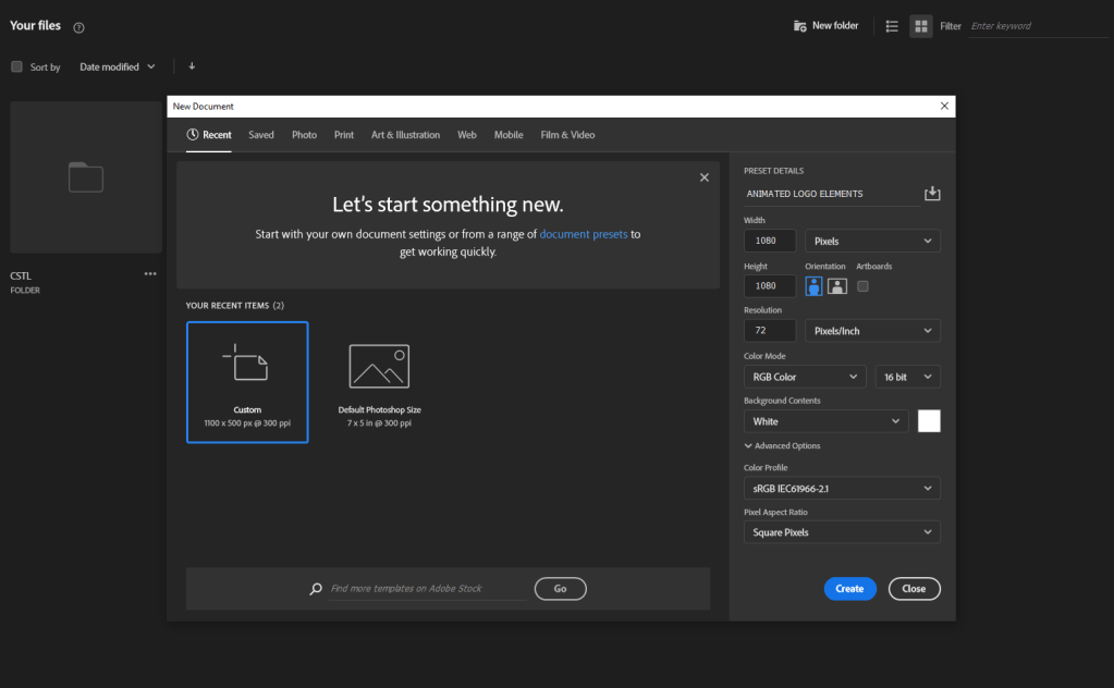
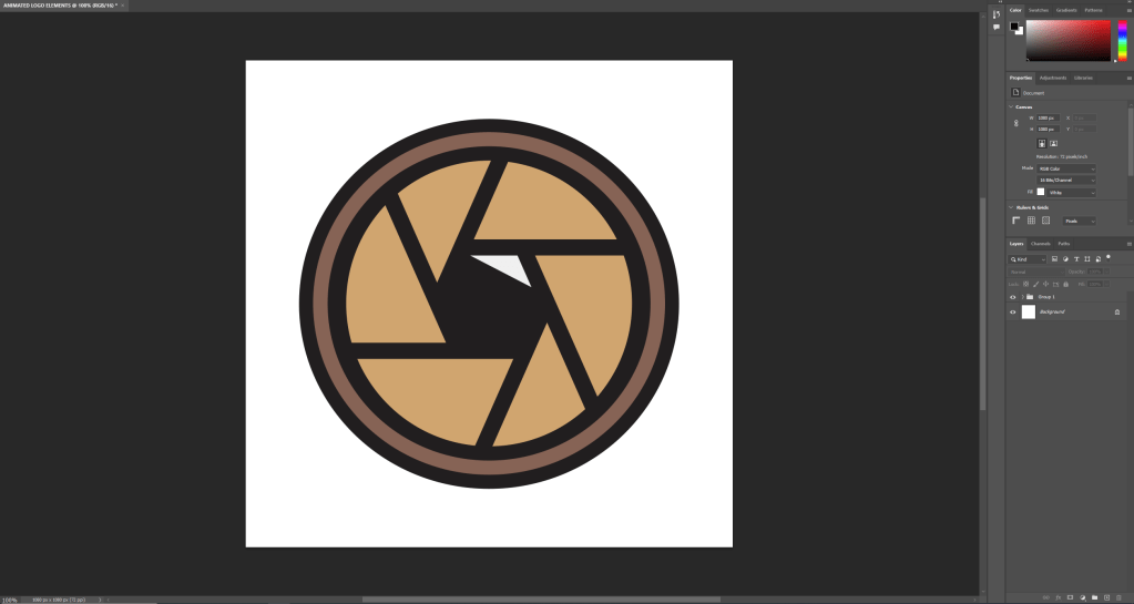
You’re going to start by creating a brand new Photoshop document with the specific dimensions that your client has told you to create this animation. In this case we’re creating a 1080×1080 pixels, 72 dpi, RGB document.

STEP #2 – OPEN YOUR LOGO

Import your logo as a png. file from Illustrator or wherever you created your icon in. Make sure that you are using layers and it is not a still image. I took this from illustrator and pasted it to have all of the layers.

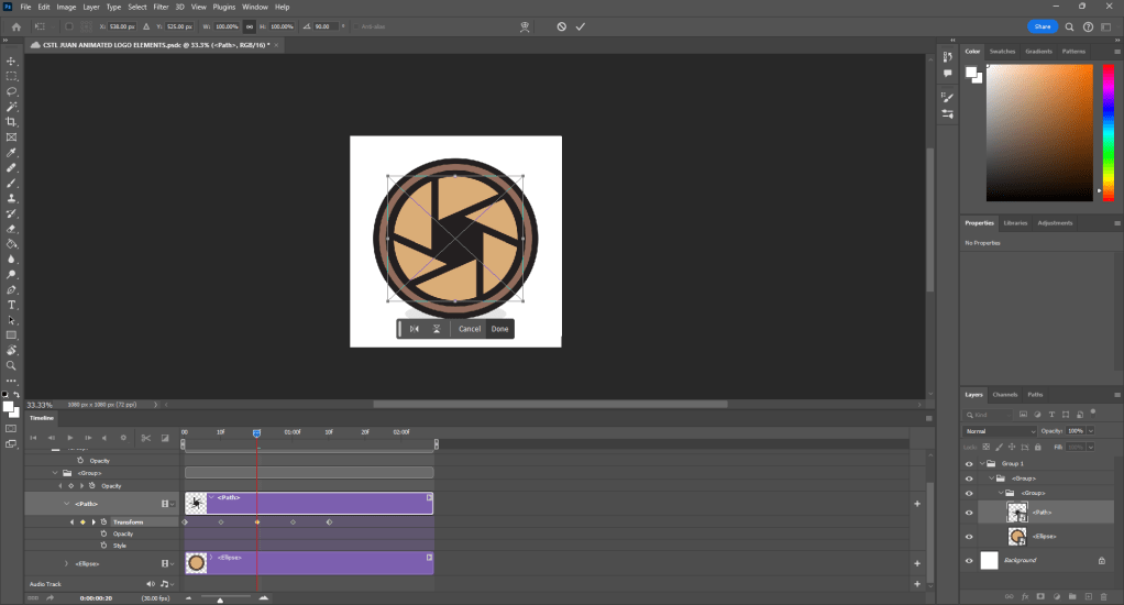
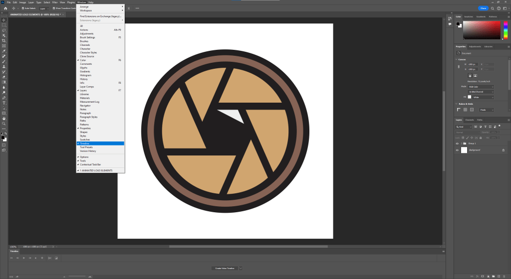
STEP #3 – TURN ON TIMELINE

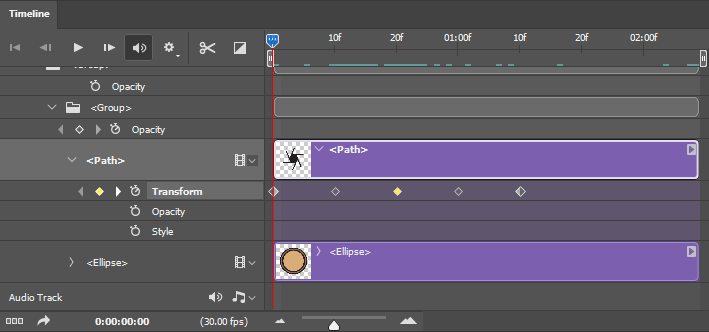
In order for you to be able to edit this and turn it into an animation, you’ll have to open the timeline. If you don’t have it open, go to Window > Timeline.

STEP #4 – ANIMATE

In this case, what I want is to move my camera’s lens. So in order to execute this I will do what is called adding a keyframe. The way you do this is you click on whichever action you want the animation to take. Right now I’ll click on transform, because I want it to rotate.

To rotate it, I’ll click on the desired stop time, and press ‘Ctrl + T’, so that I can move the object, and in this case, rotate it.

STEP #5 – FINAL TOUCHES

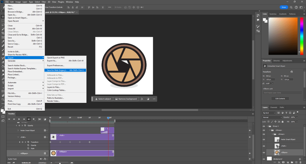
I wanted to add a little flash. What I did to achieve this was copy and paste the triangle that looks like a camera flash onto the timeline. Then, by clicking on the square that’s next to the scissors, the half black and half white square, I clicked fade into white, and dragged it into the triangle. You can adjust how long you want the fade to last.

STEP #6 – EXPORT

Congratulations! you have just completed your first animated gif file in Photoshop. Now, in order to show your masterpiece to the world, you’re gonna want to go on File > Export > Save for Web (Legacy).

Next step is to save the gif. file. The way you do this is by clicking on the tab that says [GIF]. I also clicked the preset ‘GIF 128 DITHERED’. What this allows me to do is to save the animation as a smoother file directly from the Photoshop software. The app creates smooth transitions for your animation based on the color palette and amount of colors that are inside of your file. The higher the number (such as 128), the more colors it supports.

CONCLUSION

And you are done. Next time, use Animate or After Effects, unless you’re being forced to use Photoshop. Still though, you can make some professional animations with this software, it’s all just a matter of patience and practice, good luck.

Photo by Denny Ryanto on Unsplash; edited by Juan Castillo
All photos used throughout the article by me.