RGB TO CMYK

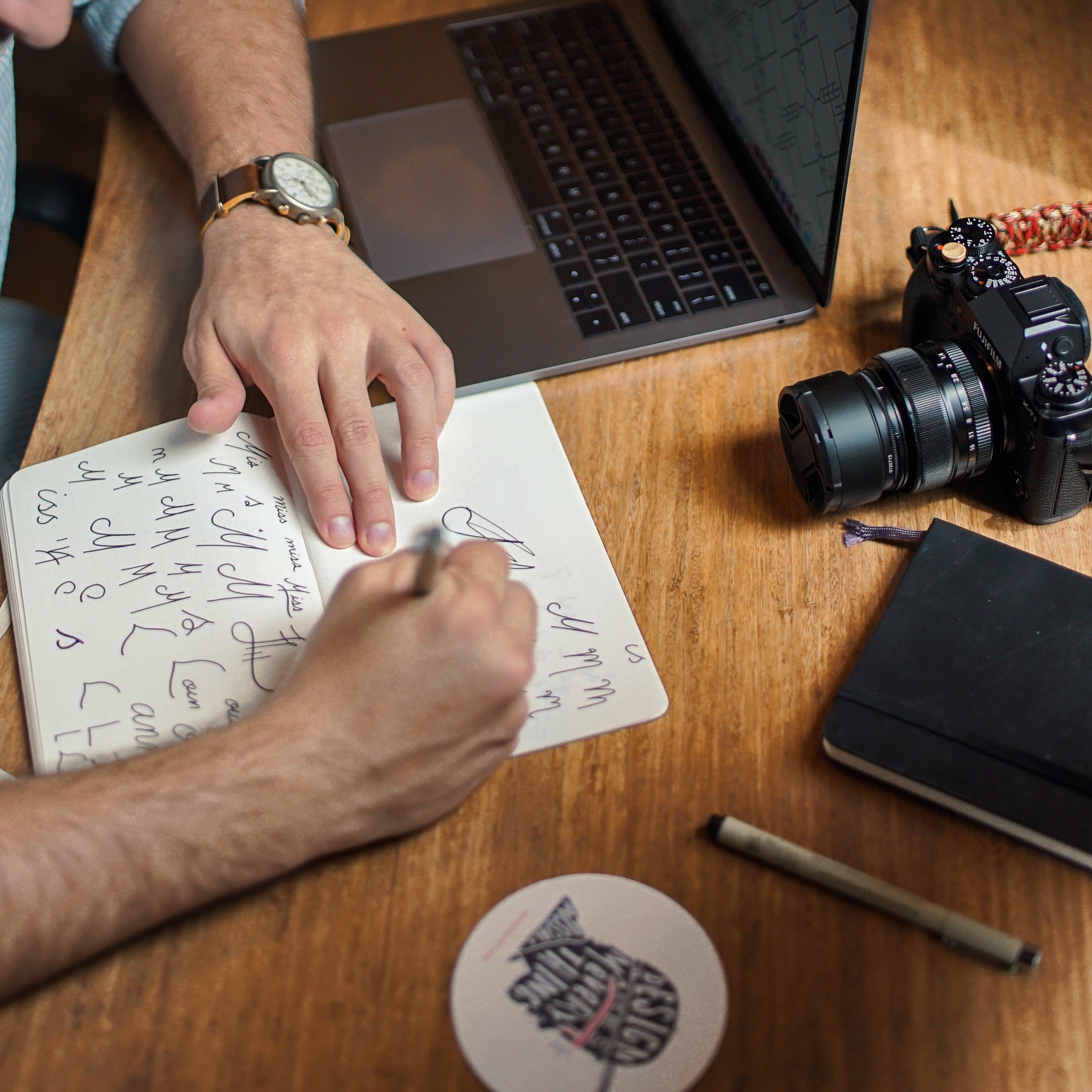
This article is a step-by-step tutorial aims that provides a detailed walkthrough of the entire procedure, from opening the image to making the final adjustments for print. Whether you are an experienced designer or new to the process, this guide will help ensure that your designs are prepared for optimal print quality.

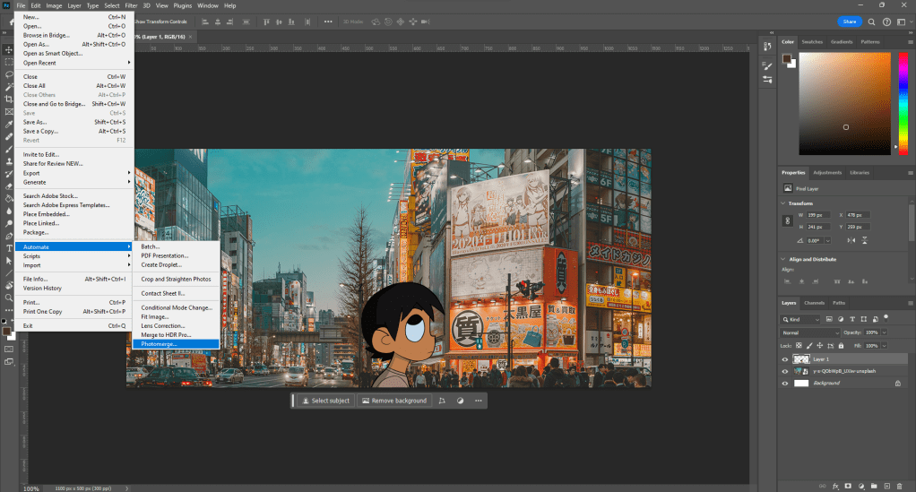
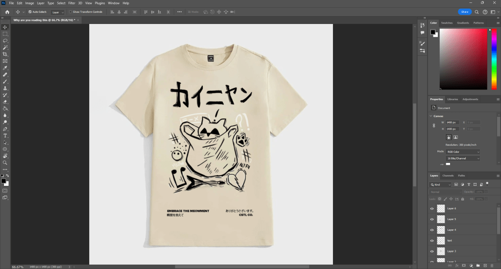
STEP #1 – OPEN IMAGE

Open your image in Photoshop by importing the file you are working on or want to convert. Ensure that your image is in a format that supports CMYK, such as PSD.

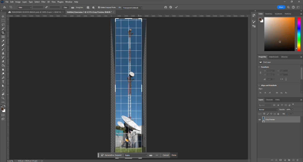
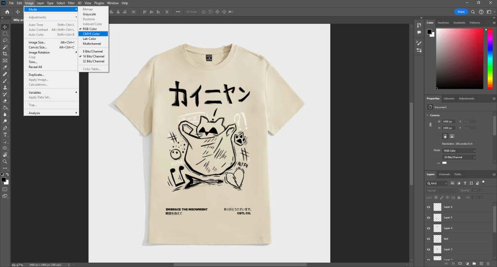
STEP #2 – CHANGE MODE

Look for the “Image” option in the menu bar at the top of Photoshop. Click on it and choose “Mode,” then select “CMYK color” to convert your image from RGB to CMYK.

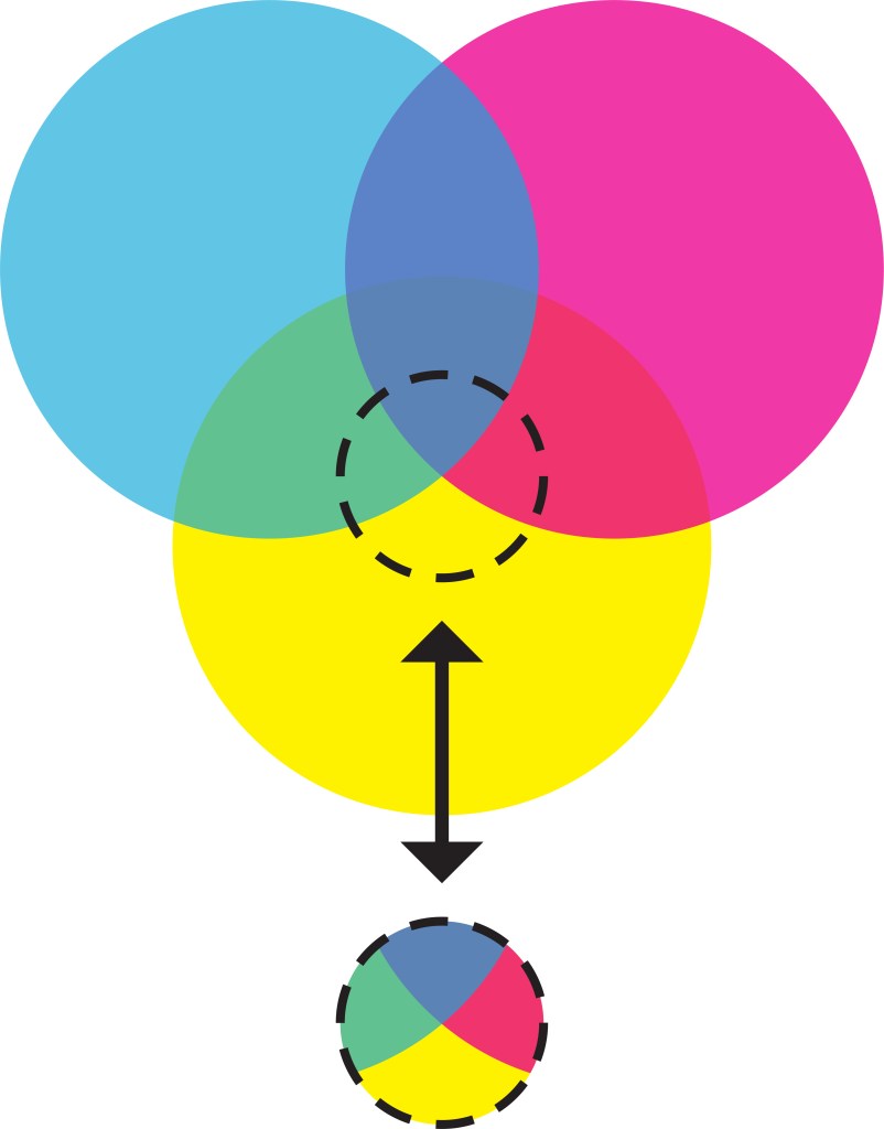
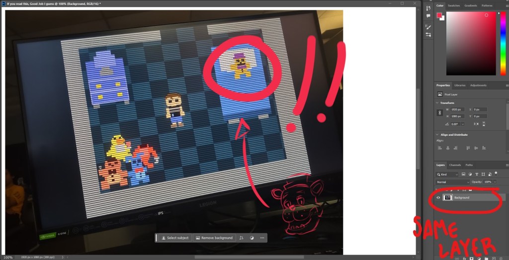
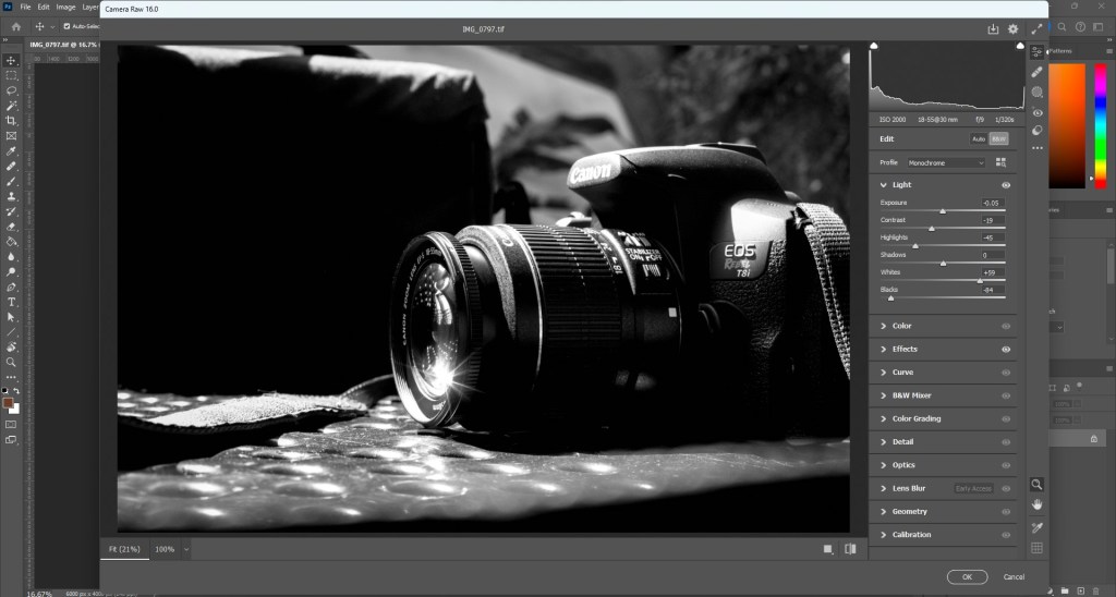
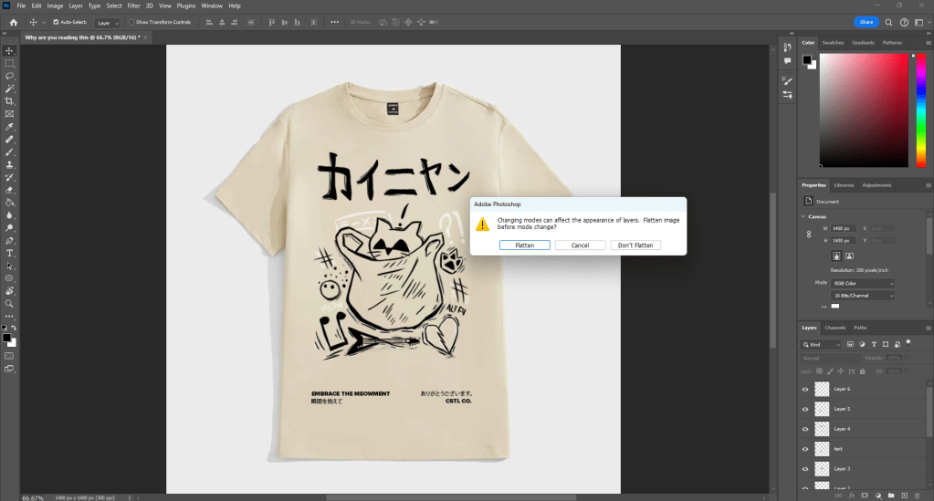
STEP #3 – COLOR MODES/CODES

After converting to “CMYK color” Photoshop may give a warning about the color mode conversion. Read the warning, but in most cases, it won’t harm your design process. Remember, RGB is best for on-screen viewing, while CMYK is optimized for print.

STEP #4- CHECK AND ADJUST IMAGE QUALITY

After converting to CMYK, closely examine any color shifts or quality changes in your picture. Some colors may appear differently in CMYK. Use the adjustments bar above your layers to make non-destructive adjustments if needed.

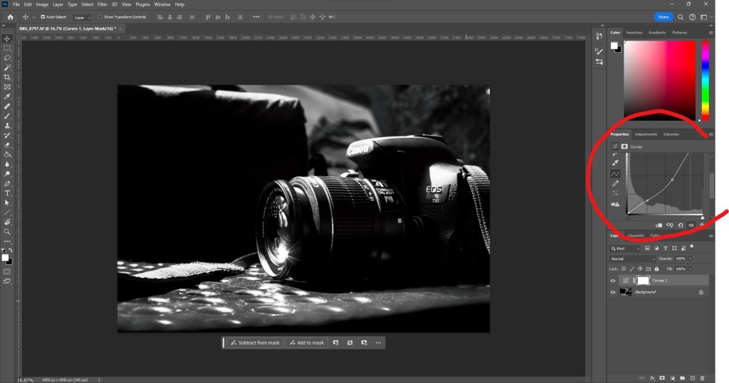
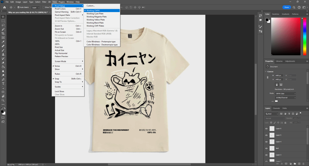
STEP #5 – SEE EFFECTS ON IMAGE

To see how your image will look when printed using CMYK, switch your document’s view to CMYK. Go to “View” then “Proof Setup” and choose “Working CMYK” This provides a preview of how your image’s colors will appear when printed.

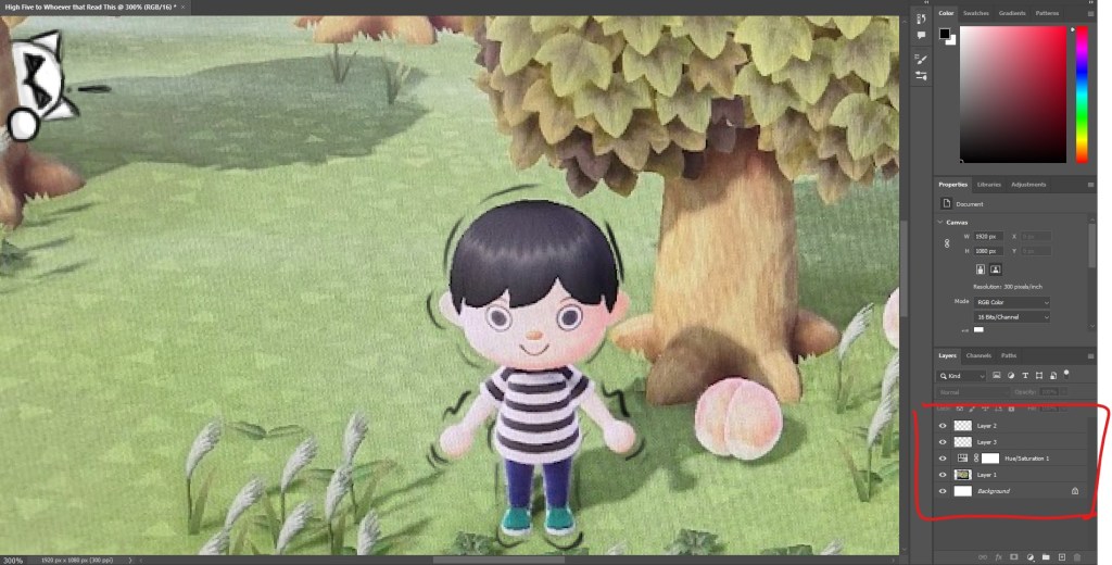
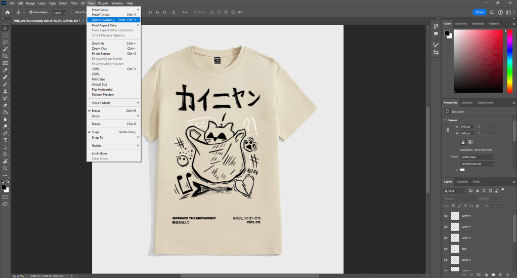
STEP #6 – ADJUSTING COLORS + COLOR GAMUT

Use the “Gamut Warning” feature in the “View” preset to check for any colors that may be out of the CMYK gamut. If needed, make color adjustments using the adjustments panel above your layer panel, such as using “Hue/Saturation” to improve specific colors.

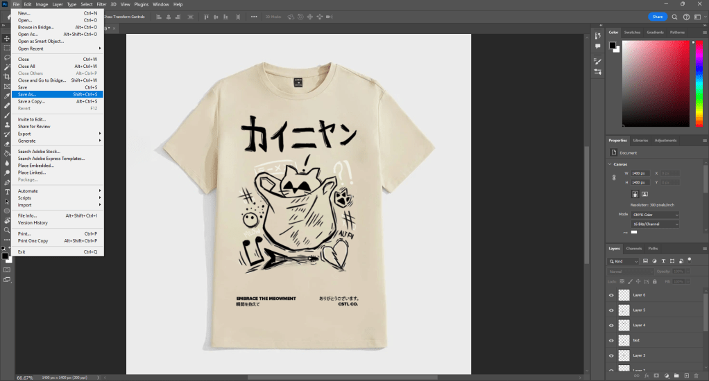
STEP #7 – FINAL TOUCHES

Make sure to save your work along the way. Before making final adjustments, save a copy of your file in PSD format suitable for printing. Go to “File” then “Save As” and choose PSD to preserve your original image in RGB and allow for further adjustments.

STEP #8 – SAVE FOR PRINT

Once you are filled with pride in your creation and satisfied with the alterations, it’s time to save it for print. Navigate to the top menu bar and choose “File” A dropdown menu will emerge, from which you should select “Save As” option. For a format tailored for printing, like PSD, and ensure to pick the suitable resolution for your printing requirements.

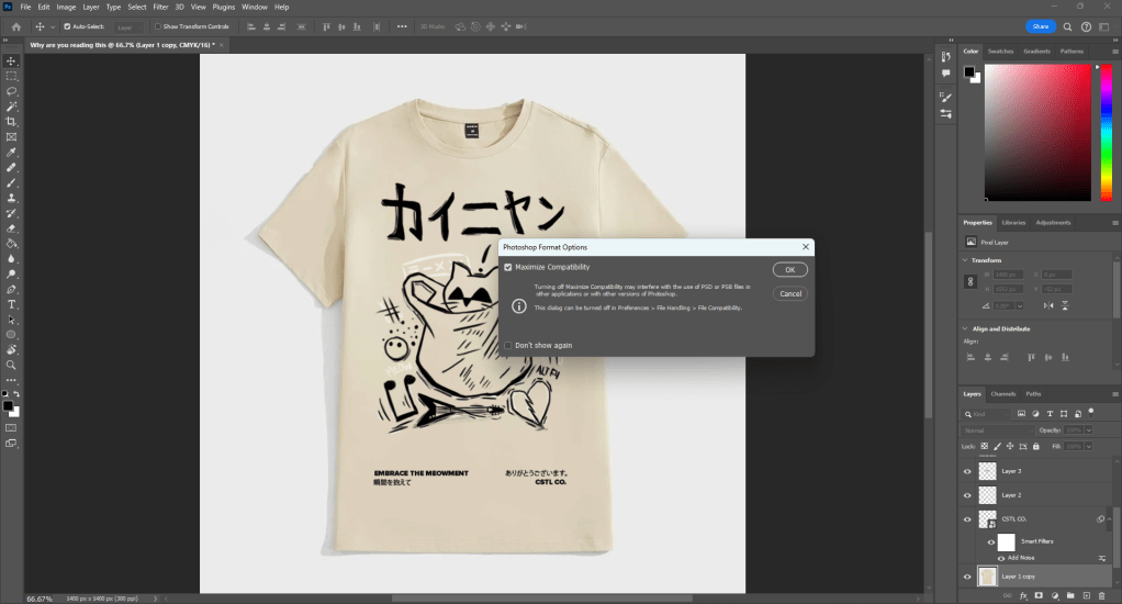
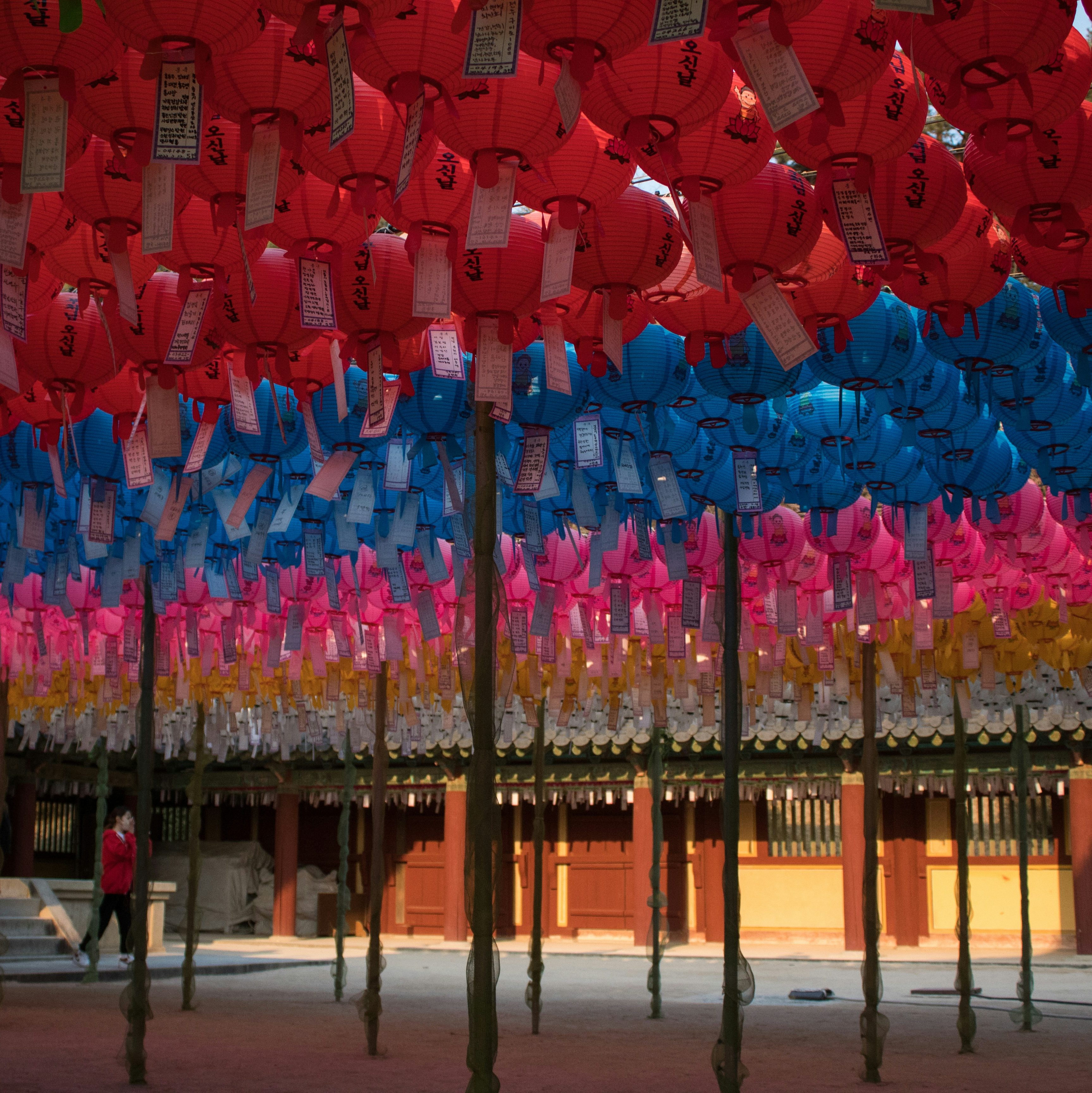
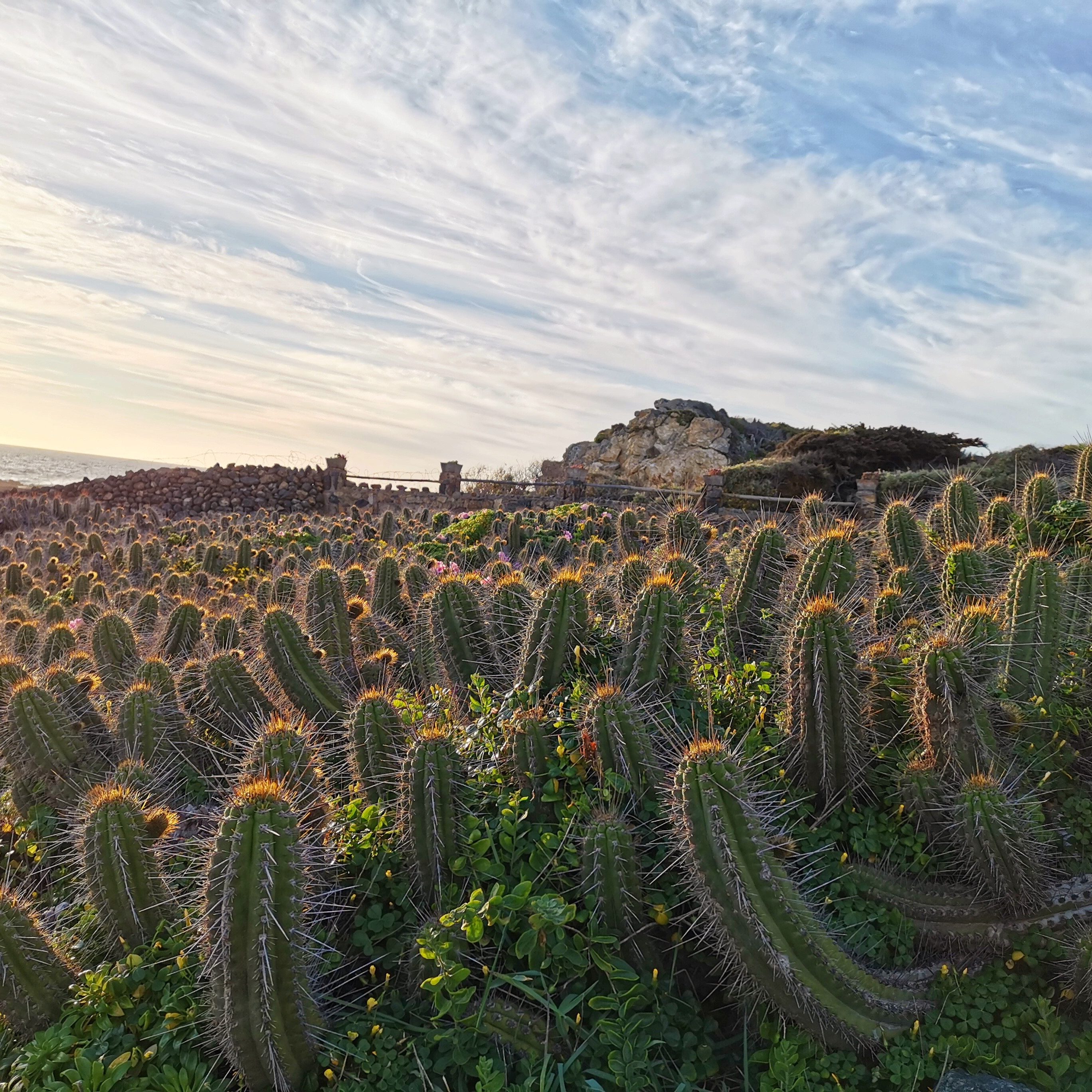
Photo by Hyeongmin on Unsplash; edited by Juan Castillo
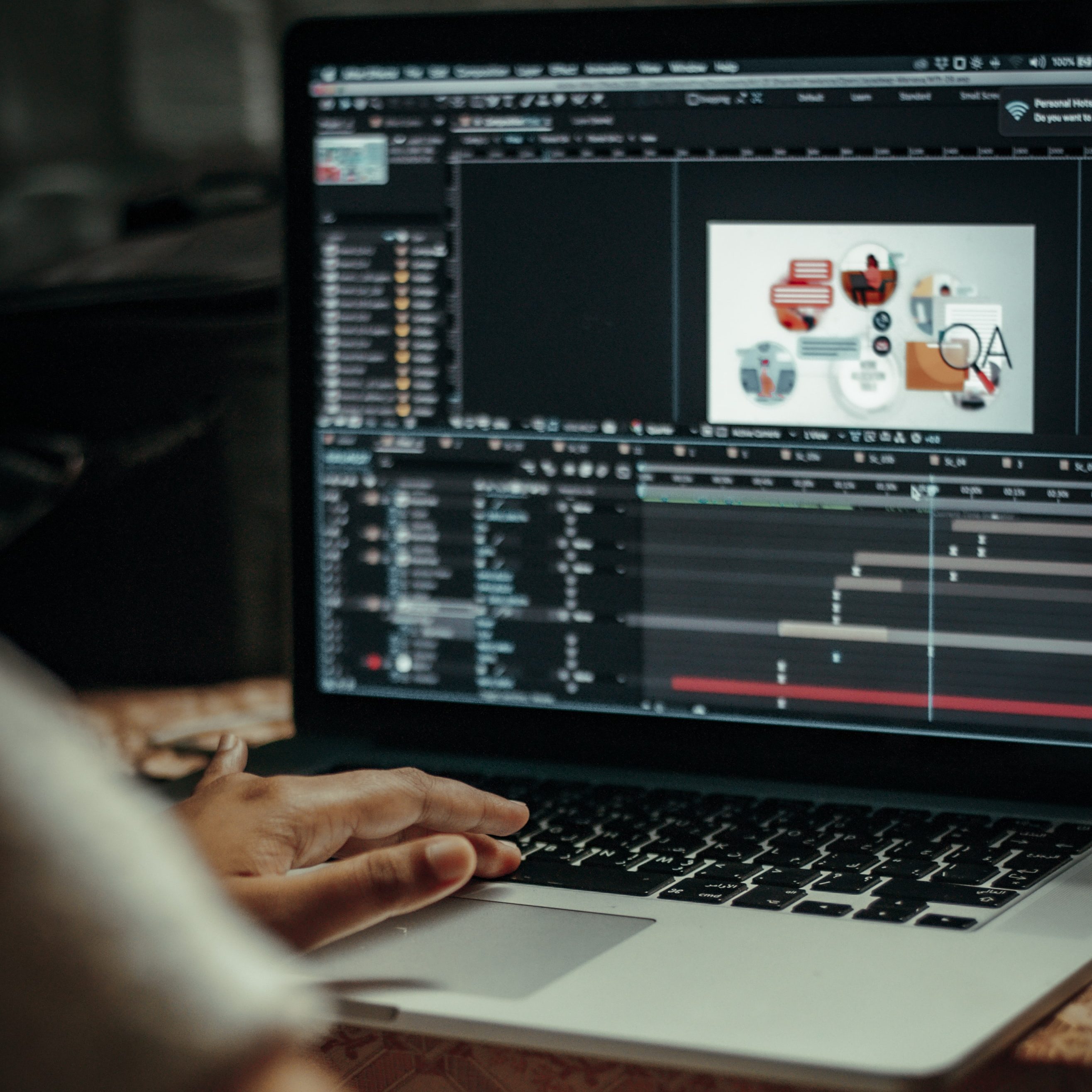
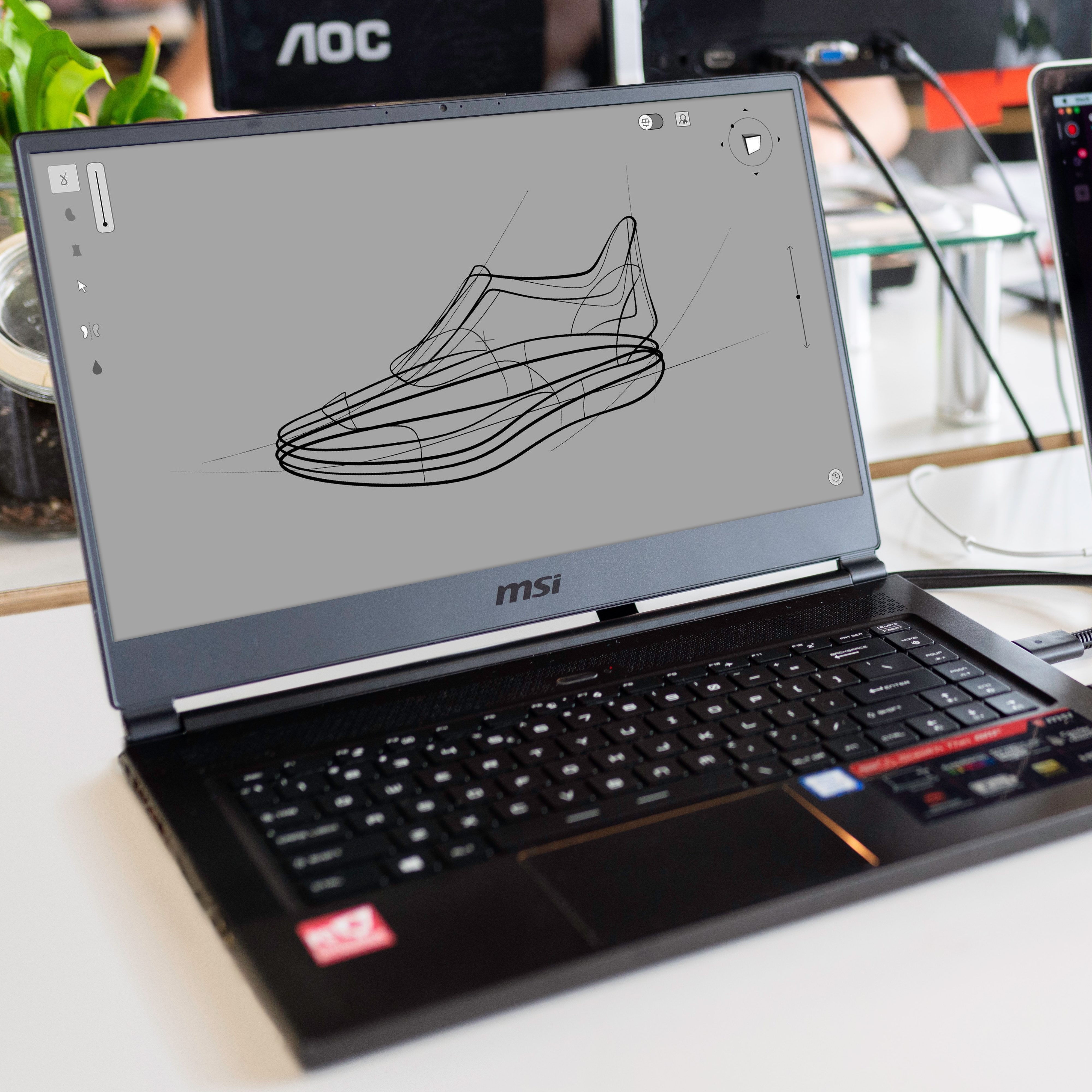
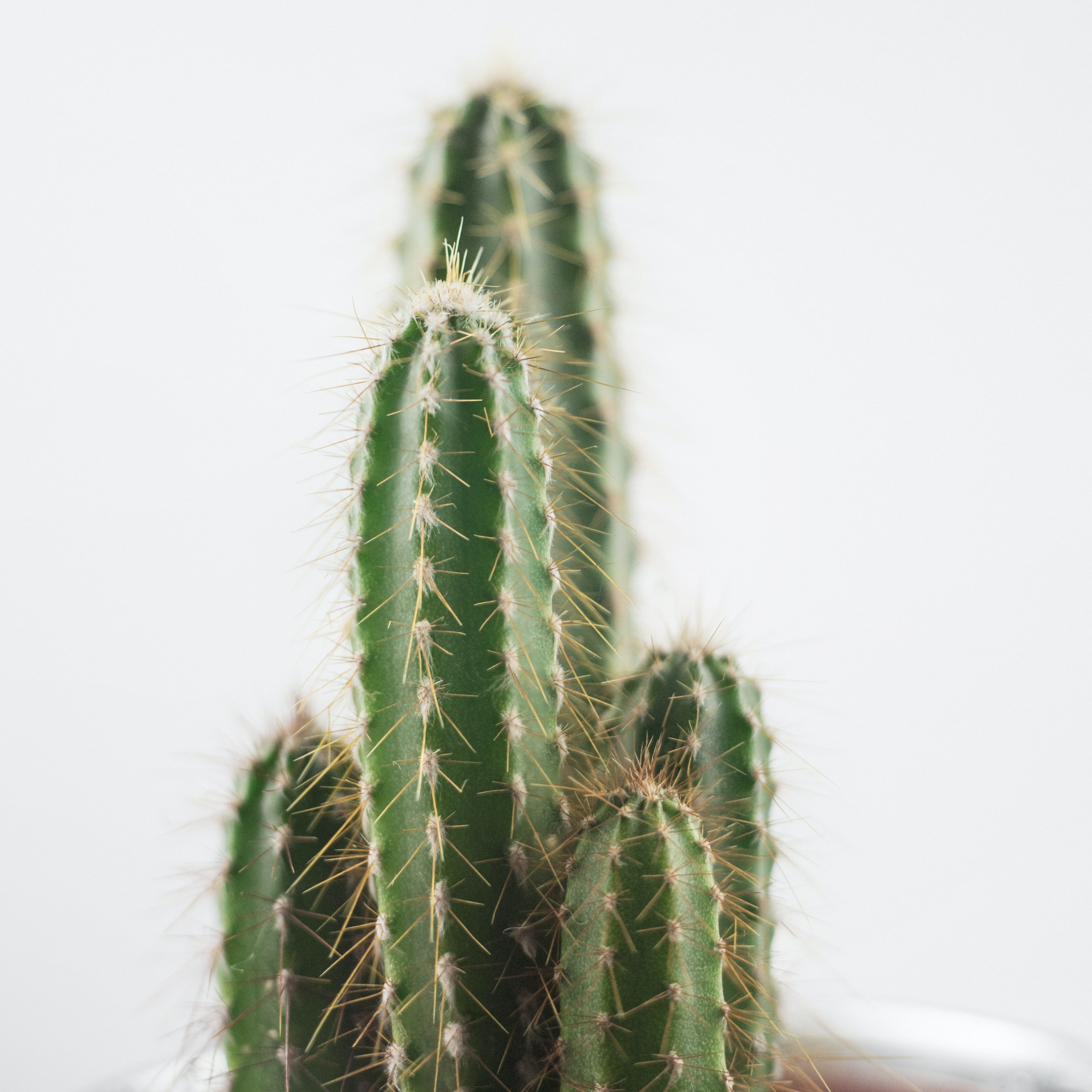
All photos used throughout the article by me.

WEB SAFE COLORS

Photo by Yoan on Unsplash

Web safe colors, also called browser safe colors, are specific sets of colors that stay the same and don’t get messed up when shown on different web browsers with 256 colors. This was really important in the early days of the internet when computers only had graphic cards with 256 colors or less. Browsers agreed on a standard set of 216 colors that worked on most screens. Older monitors could only show 16 colors, so a trick called dithering was used to make it look like there were more colors by creating patterns.

Web safe colors are represented by specific RGB values, including 0, 51, 102, 153, 204, and 255. Before Netscape and Microsoft introduced standard palettes, browsers had to use these RGB values to define their web safe colors. Web safe colors are often shown in hexadecimal format, from #000 (black) to #fff (white).

When making a website with a solid color background or creating graphics with see-through backgrounds, it’s best to use web safe colors to avoid display problems and ensure everything looks good. Using non-web safe colors, especially for see-through parts, can make things look fuzzy on some browsers. Dithering can make color changes look smoother and add more colors, but it also makes files bigger, so it’s better to use it carefully, especially for color changes like ombre effects in pictures.

Photo by Juan Castillo

SPOT COLORS

Spot colors, also known as Solid colors, are not like other color codes such as CMYK because they don’t mix colors during printing. Instead, they come in a pre-made formula or a specific ink. For example, imagine a specific shade of blue that might be made through mixing colors in process printing, but with spot colors, you can get that shade of blue already mixed in a formula.

As a designer, you should use spot colors when the job needs very specific colors, like for a brand’s logo. It’s also good for jobs with less than 4 colors as it can be cheaper to print with spot colors. Spot colors are also used for metallic or fluorescent colors that are hard for CMYK to print, for designs with big areas of solid colors that need to match exactly from one piece to another, and for printed pieces with small text.

RGB, CMYK, & HEX

To start, color codes fall into two main categories: Printing and Onscreen. CMYK is used for printing, while RGB and HEX are for onscreen use.

CMYK (cyan, magenta, yellow, black), also known as Four-color process, is commonly used for items like brochures, flyers, posters, and postcards. It’s made by combining tiny dots of the four ink colors and overlapping large and small transparent dots to create various colors.

RGB (red, green, blue) is mainly used for computers, TV screens, and mobile devices. Colors are shown onscreen by using combinations of red, green, and blue. This is different from CMYK because it’s an “additive” process. When you take away all three colors, you get black, and when you mix them together, you get white.

HEX (hexadecimal color) is often used by web designers. A hex color is shown as a 6-digit combination of numbers and letters, representing its mix of red, green, and blue (RGB).

Photo by Red Shuheart on Unsplash; edited by Juan Castillo

MULTIMEDIA CAREER PATHS

As a multimedia design student, the world of career opportunities is vast and dynamic. Delving into this field means unlocking the potential to craft captivating visual experiences across diverse platforms like the web, movies, and video games. From creating compelling advertisements to shaping interactive presentations, the role of a multimedia designer is a gateway to a rich tapestry of professions, each with its own unique scope and earning potential. Let’s go into each and every possible career choice that is available in this realm of multimedia design.

Photo by Tyler Casey on Unsplash

1. MULTIMEDIA PROJECT MANAGER ($96,500-97,000)

As a multimedia project manager, you’ll lead and coordinate the production of multimedia projects. Your role involves managing resources, organizing shoots, and ensuring that the project meets its requirements. You’ll also track costs and provide regular updates on the project’s progress.

Photo by Sarath P Raj on Unsplash

2. ANIMATION DIRECTOR ($171,000)

As an animation director, you’ll oversee the creative process of animations, from design to post-production. Working at a film or video company, you’ll collaborate with writers, illustrators, and visual designers to bring stories and graphics to life through animation.

3. MULTIMEDIA ENGINEER ($80,000- 131,500)

As a multimedia engineer, you’ll work closely with animators, programmers, writers, and other professionals to create designs. Your responsibilities may include setting up and maintaining electrical equipment for media programs, such as sound and video systems.

4. 3D ANIMATOR ($49,500-62,500)

As a 3D animator, you’ll use art and technology to produce 3D animated creations. Your main task involves generating visual designs on a computer and using 3D printing technology to create real-life models. This can include creating gaming equipment and film props.

5. ANIMATOR ($45,500- 133,000)

As an animator, you’ll bring moving images to life for various media, including television, movies, and video games. Your duties may involve designing illustrations to match scripts and rendering images for different media platforms.

Photo by Nathan Dumlao on Unsplash

6. SOCIAL MEDIA MANAGER ($44,700)

As a social media manager, your role is to represent a brand on social media platforms and devise strategies to enhance its visibility and engagement with the audience. You’ll manage advertising budgets, analyze performance metrics, and create compelling content using various media formats to connect with the audience.

Photo by Peter Stumpf on Unsplash

7. VIDEO EDITOR ($43,400)

As a video editor, you’ll be responsible for crafting and refining videos for broadcasting to audiences. Your tasks may include incorporating special effects, graphics, music, and text to tell engaging stories through your productions. You might also edit existing videos to enhance their quality or include missing information.

Photo by Onur Binay on Unsplash

8. MULTIMEDIA SPECIALIST ($52,000-77,000)

As a multimedia specialist, you’ll collaborate with designers and writers to create captivating visual elements for different media forms like broadcast media, video games, marketing, and the web. Your focus will be on designing effects, graphics, and visuals that complement stories or written materials.

Photo by Matthew Kwong on Unsplash

9. ANIMATION PRODUCER ($38,500-62,500)

As an animation producer, you’ll coordinate the production of animated media, working closely with studio executives, creative teams, and clients. Your responsibilities may include developing storytelling concepts and ensuring that projects meet budget requirements.

10. JOURNALIST ($35,500)

As a journalist, your task is to create compelling news stories and deliver them through various media formats, such as videos, articles, photos, radio, or television. You’ll conduct thorough research, unbiased interviews, and present stories to the audience with honesty and integrity.

CONCLUSION

In conclusion, the field of multimedia design offers a wide range of exciting career opportunities, from creating captivating animations to crafting compelling stories through various media formats. Professionals in this field work collaboratively to produce visual and interactive content for diverse platforms, including the web, video games, and broadcast media. With roles such as animation director, multimedia engineer, social media manager, and journalist, individuals can pursue fulfilling careers that allow them to unleash their creativity and engage audiences across different channels. The diverse nature of these roles provides ample opportunities for those with a passion for multimedia design to explore and make a meaningful impact in the industry.

Featured image by Sava Bobov on Unsplash ; edited by Juan Castillo

DESTRUCTIVE VS NON-DESTRUCTIVE

In simple terms, destructive editing means you’re essentially destroying something. Specifically, when you apply this to an image, you’re making permanent changes that can’t be undone, effectively erasing the original image. On the other hand, non-destructive editing allows you to make numerous changes while preserving the original image. This method stores all the edits as separate layers, which can be adjusted, removed, combined, or restored without altering the original image. You can even delete all the changes and still have the original image. Some techniques for non-destructive editing include using camera raw, masking, and retouching on a separate layer, which we’re going into more depth inside this article.

DESTRUCTIVE

Using a destructive editing style has several drawbacks. When you edit destructively, you’re directly altering the original image without using layers, which makes it difficult to undo changes. This approach consumes a lot of time and limits your flexibility due to its permanent nature. For example, if you adjust the exposure of a picture and then apply a filter, the original exposure is lost, leaving you with limited options to revert the changes. Even minor edits like cropping or rotating an image can be destructive without using layers. To achieve the desired final result, you may have to restart the editing process from scratch or continually make corrections to undo or mask your mistakes. As we can see in the example below, I drew in the same layer. If I wanted to erase a mark for example, the whole background would be affected, because it’s all in the same layer. A more intelligent approach would be to create a brand new layer and draw there.

NON-DESTRUCTIVE

On the positive side, you can avoid these issues by utilizing a non-destructive editing style, as mentioned before. This method enables you to freely make changes to an original image without causing any damage. Non-destructive editing involves using layers and masks to edit your image as desired, regardless of the number of changes made, ensuring that the original image remains intact. This eliminates the need to start over. As mentioned earlier, layers are incredibly useful as they capture every edit, such as cropping or adding filters to your image, allowing you to always revert to the original, even if the image looks completely different. As you can see below, I did the same thing as the last example, I drew over my photo. This time, I thought more carefully, and made extra layers depending on what I wanted to do with the photo. You can’t just draw and color in the same layer as well, as this is basically destructive editing, so I made a designated layer for each, as it should be. Notice that the Hue/Saturation was applied as a layer and not as a filter, giving me the chance to adjust it if I need to and not ruin the whole project.

RASTER ART

Raster files consist of images constructed from pixels, which are tiny colored squares. These pixels, when combined in large numbers, can form intricate and stunning images. The quality of a raster image is determined by the number of pixels it contains. The file type, such as JPEG, GIF, and PNG, influences the quantity of pixels in an image. Higher pixel counts generally result in higher image quality. However, a drawback of raster images is their resolution, which is often measured in DPI (dots per inch) or PPI (pixels per inch). When you zoom in on a raster image, the individual pixels become visible, and as you continue to zoom, the image loses its sharpness and clarity. Below you can see this drawing I made. This example right here was drawn in Photoshop, meaning it was drawn using pixels. As I mentioned earlier, the more you enlarge the image, the lower the quality.

VECTOR ART

In contrast, vector files utilize mathematical equations, lines, and curves with fixed points on a grid to create images. Unlike raster files, vector images do not consist of pixels. Instead, these mathematical formulas capture the shape, size, and color to construct an image. Additionally, vector images can be scaled up or down without sacrificing quality, as the mathematical nature of the file allows for recalibration of size without loss of detail. This makes vector files particularly suitable for images that need to appear in various sizes, such as logos and illustrations used across different media. Due to their ability to maintain quality at any size, vector files are highly favored for applications where scalability and flexibility are crucial. The image below is the same example I showed earlier but converted into a vector using Adobe Illustrator. As you can see, when I enlarge the image, it does not lose its quality whatsoever, and that in simple terms are what vector art is all about.

Featured image by KIBOCK DO on Unsplash; edited by Juan Castillo

Images used throughout article by Juan Castillo

MOOD BOARDS

In the realms of design, mood boards are utilized as a visual bridge, capturing ideas and thoughts before they are fully formed. These collections of ideas include colors, images, textures, typographies, and more. They clarify the designer’s vision. Even if you are a professional designer or just a beginner who is entering the world of design, understanding the importance of mood boards can greatly enhance the quality and precision of your works. Let’s see how these visual compasses can help you navigate through tons of different creative paths.

PURPOSE OF MOOD BOARDS

At its core, a mood board is a visual brainstorming tool, a collection of images, colors, fonts, and sometimes materials that capture an idea or style for a design. Designers stand by them, and for good reason. These boards serve as an organized space for inspiration, allowing flexibility to add or remove elements as a specific vision evolves. More importantly, they’re a powerful communication tool. When presented to clients, a mood board offers clarity, ensuring both the designer and client are aligned in their vision. And the best part? Creating a mood board isn’t complex, making it an accessible tool for various purposes, from design projects to personal dreams.

HOW TO CREATE ONE

Mood boards, as mentioned earlier, are simple yet powerful tools for designers. You should begin with a color palette and typography choice to set your brand’s tone. You should always communicate with your clients to ensure the board reflects their vision (or your vision). Now, as for actually creating your mood board, here are some website recommendations that may be helpful when brainstorming. If you’re looking for inspiration, Pinterest is a goldmine, allowing you to find images and ideas that align with your aesthetic. To enhance your board, seek feedback from fellow designers or friends. If you need royalty-free, high-quality images, platforms like Unsplash, Pexels, and Dribbble are excellent choices. For color palette choices, Adobe Color is a useful resource. To compile your mood board, consider Canva, Vistacreate, or Adobe Spark. For further customization and collages, Photoshop is your best friend. Once your mood board is ready, talk with your client and see if you find and fix any errors in the brand’s portrayal, ensuring a flawless blend of your creativity and their vision.

Featured image by Yonghyun Lee on Unsplash ; edited by Juan Castillo

EXPERIENCE WITH PANORAMAS

Compared to the black and white photo presentation, this one was fairly simple and easier to execute (in my opinion). The overall shooting and editing process was less of a hassle. In this article I’ll talk about my own experience while taking these photos as well as give my own opinion and advice on how you can create the perfect panoramic images.

SHOOTING PROCESS

Compared to the last project, creating the perfect scene may have been more difficult since panoramas themselves are captivating and intriguing pieces of art that require a lot of creativity, and manpower to execute those ideas with the use of a camera. In my experience with panoramic photos, it’s essential to select a distinct spot. Taking multiple shots based on the rule of thirds and then merging them is key. Conceptualizing a singular, expansive creative image and then breaking it down into multiple shots in a short amount of time was challenging. My concept was to feature a subject, and then show their surroundings. However, I often messed up with maintaining the “rule of thirds,” leading to some overlaps in the editing phase as subjects ended up in the same frame. I noticed that open spaces, especially outdoors, are ideal for panoramic shots because of the expansive backdrop they offer. Therefore, adding on to the “rule of thirds” is crucial to produce a flawless, creative image.

EDITING PICTURES

First, I opened Photoshop and navigated to File > Automate > Photomerge. Here, I chose the photos I intended to merge into one panoramic shot. Photoshop offers various panorama styles, like perspective and reposition. It’s worth experimenting to see which style suits your photos best. I typically leaned towards the auto or spherical options. Once merged, you can tweak with the lighting, contrast, and saturation to refine the image to your liking.

All photos I took went through this editing process. For instance, my first photo was overexposed and lacked some saturation. The second had some cropping and lighting issues, and the third was underexposed. With some adjustments to lighting and color, I achieved my desired results. One thing to remember is that Photoshop’s panoramic function often leaves a transparent background, represented by white and grey squares. So, remember to crop out these areas before finalizing and exporting your image.

MY ADVICE

For you beginner photographers eager to dive into the world of panoramas, the journey is both thrilling and rewarding. Start by selecting a scenic location with a broad viewpoint. As you capture your shots, ensure a substantial overlap between images, making the merging process smoother. Once you’re ready to stitch them together, Photoshop is your best ally. Experiment with various options available. Adjust lighting, contrast, and saturation to bring out the best in your panoramic shot. Remember, the key lies in trial and error; with every panorama you shoot and edit, you’ll grow more proficient and effective in your approach.

Featured image by Y S on Unsplash; edited by Juan Castillo

Pictures used throughout the article by Juan Castillo

EXPERIENCE WITH BLACK AND WHITE

Walking through the familiar hallways of school, you might overlook the artistic potential around you. Recently, I went on this journey, transforming normal school moments into captivating black and white memories using just a camera and a bit of Photoshop. If you’re new to photography and want to uncover the stories lurking in plain sight, keep reading as I share some of the lessons I learned along the way as well as tips to help you find the perfect photo.

SHOOTING PROCESS

To be honest, the toughest part was the execution of taking the photos. As soon as GD brought up the idea of a “creative picture”, things suddenly started to feel way more challenging. I was left wondering, “What can really count as a creative shot, and how can I even capture that?” After two weeks messing around with the cameras and snapping shots at school, I felt like I’d hit a creative wall. I wasn’t going to take a picture of any random thing and call it a day. I wanted my photos to have potential, some spark. But that proved to be tougher than expected, and many of my photos didn’t even make the cut for my final project. I discovered, pretty last minute, that shots with lots of detail or busy visuals didn’t really work well in black and white. After three days of hunting down interesting subjects and setting up original scenes, I finally got my set of pictures and then came the last step, editing them.

EDITING PICTURES

Editing those 10 pictures was a truly challenging experience. It felt like a rollercoaster, playing around with different tones of exposure and contrast as well as how much detail was shown in each one. The entire process was incredibly time-consuming. I devoted so much attention to each photo that I ended up racing against time to finish the project. Perfecting the black and white shots was more difficult than I expected if I’m being honest. Just when I thought I was reaching the end, I spotted an overwhelming amount of grey tones in my edit – not ideal for a pure black and white image. Striving for that ideal balance without the photos appearing overexposed, underexposed, or poorly edited became a task that tested my patience.

On the first picture, I opened the RAW file, which is the mode where the photo is at its finest point. Personally, I prefer using this type of file because I’m able to manipulate more of the photo, unlike a JPG file, but it’s all preference.

Then I went and edited the photo using the Camera RAW filter edit tool in Photoshop which lets me change the exposure, contrast, lighting and all of the fun stuff that comes with editing photos.

Once I was satisfied with how it looked, I went ahead and added another layer and edited the curves of the photo, which essentially is taking a point, each representing the shadows, middle colors and the highlights of a photo. I manipulated this graph and ended up with a decent looking black and white edit of the photo I had taken.

MY ADVICE

Throughout this project, I explored various approaches, from my photography techniques as well as the editing strategies I chose to do. For me, a trial-and-error approach seemed to be the best choice to get the best results. When it came to taking pictures, I experimented with various angles, subjects, locations, and lighting conditions. Not every shot turned out as I envisioned, and that is alright, because with each attempt I waws able to spark new ideas and insights. My editing journey was also full of learning. I fixed every single photo, adjusting lighting and color levels for some, tinkering with curves for others, and even crafting custom curves for a few. However, I’d advise anyone diving into tools like Photoshop to at least familiarize themselves with the basics. I’ve already had enough experience working with photos as well as editing them in Photoshop, but as a beginner, you’ll want to know the program as much as possible so that the editing process is as smooth as it can be. Take the time to be one with the program, patience is key. Anyways, my advice is simple: embrace experimentation. Don’t hesitate to capture what is appealing to you, craft unconventional scenes, work with unique subjects, and absorb lessons along the way.

Featured image by Cerqueira on Unsplash; edited by Juan Castillo

Photos used throughout article by Juan Castillo

EXPOSURE TRIANGLE

Photo by Annie Spratt on Unsplash

The beautiful world of cameras and photography can be confusing and difficult at first, but it can be briefly explained as a bucket of water. The image sensor in the camera is the bucket, and the water is the amount of light that goes into the bucket. The exposure triangle, consisting of shutter speed, aperture, and ISO, determines how much light we collect. Shutter speed is how long we pour the water, aperture is the size of the opening, and ISO is the bucket’s sensitivity. Together, they help achieve a perfectly lit photo.

ELEMENTS EXPLAINED

Photo by Maxim Medvedev on Unsplash

A fast shutter speed (like 1/1000) is a quick splash of water, while a slow shutter speed (like 1 second) lets the water run longer, filling the bucket more. However, if it’s open for too long, you might spill (overexpose). If not open long enough, you might not fill it up (underexpose). The size of the faucet’s opening is the aperture. A wide aperture (like f/1.8) means a bigger opening, letting in more water (light) quickly. A small aperture (like f/16) is a tiny opening, letting in water more slowly. It also affects how much of the photo is in focus. The ISO is like the sensitivity of the bucket. A low ISO (like 100) means the bucket is less sensitive and needs more water (light) to fill. A high ISO (like 3200) means it’s very sensitive and fills up quickly. But the higher the sensitivity (ISO), the more “noise” or “grain” might appear in the picture. Balancing these three settings ensures you get the right amount of light for a great photo. If one changes, you might need to adjust the others to keep that balance.

HOW IT AFFECTS YOUR PHOTOS

Photo by Karen Chew on Unsplash

Shutter Speed: Has effects on light, it determines how long the camera’s sensor is exposed to light. The higher the shutter speed, the less light that comes in, and the slower the shutter speed, the more light that comes in. Its effects in motion are fast shutter speeds (e.g., 1/1000 sec) that can freeze fast-moving subjects, making them appear sharp. Slow shutter speeds (e.g., 1 second) can introduce motion blur, which can be used creatively for effects like capturing the flow of water or the trails of stars.

Aperture: The aperture controls the size of the lens’s opening. A wider aperture (e.g., f/1.8) lets in more light, while a narrower aperture (e.g., f/16) lets in less light. It also affects the depth of field, or how much of the image is in focus. A wide aperture results in a shallow depth of field, making the background blurry while keeping the subject sharp. It’s mostly used for portraits. A narrow aperture increases the depth of field, keeping both foreground and background in focus, which is mostly used in landscapes.

Photo by Levi Loot on Unsplash

ISO: ISO affects the sensitivity of the camera’s sensor to light. A higher ISO value (e.g., 3200) increases sensitivity, allowing for better performance in low light, while a lower ISO (e.g., 100) decreases sensitivity. The increased sensitivity at high ISO values adds “noise” or “grain” into the image. Photos can appear grainy or speckled at very high ISO settings. Lower ISOs produce cleaner images with less noise. In essence, each of these elements not only affects the amount of light that is captured in your photos but also introduces artistic and practical effects that photographers can balance for their desired outcomes.

OVEREXPOSED VS UNDEREXPOSED

If a picture appears overexposed, it means there’s too much light in the photo, making it too bright. This can wash out details and colors, and important parts of the picture might be completely white. On the other hand, if a picture appears underexposed, it might appear too dark because not enough light reached the camera sensor. This can result in loss of details in shadows, making the image look too dim, and important parts might appear as featureless black areas. The goal is to find the right balance to capture a well-exposed photo with just the right amount of light.

Underexposed
Overexposed

Photo by DLKR on Unsplash; edited by Juan Castillo
Overexposed VS Underexposed photos by Juan Castillo

COLOR & TYPOGRAPHY

In our daily lives, we come across countless visuals: from app interfaces to magazine ads, from websites to billboards. Have you ever thought why some visuals are more appealing than others? Two crucial elements that play a significant role are color and typography. They’re like the salt and pepper of design: they may seem irrelevant, but they can either make or break the dish.

COLOR THEORY

Photo by Luca Deasti on Unsplash

Colors are for more than just ‘aesthetics’; they’re silent communicators of the visual world around us. Designers use the Color Theory to make their designs stand out and resonate with their viewers. Think of color theory like a guide book for mixing and matching colors. By understanding which colors work well together, designers can create visuals that are pleasing to the eye. The same way you wouldn’t throw random ingredients into a recipe, designers choose carefully which colors match with which to create a final product that grabs the viewer’s attention. They use color theory to ensure that their designs evoke the right emotions, grab attention, and deliver a clear message.

THE COLOR WHEEL

Color wheel by Juan Castillo on JUAN CSTL

Designers often turn to the Color Wheel as their trusted guide when selecting shades for their designs. Picture a vibrant circle showcasing every color we can lay our eyes on. This wheel isn’t just a rainbow of hues; it’s a roadmap that helps designers pick color combinations that truly stand out. At the very core of this wheel, you’ll find the primary colors: red, yellow, and blue. These are like the original “parent” colors because you can’t make them by mixing others together. When you blend these primary colors, you get secondary colors like green (from blue and yellow), orange (from red and yellow), and purple (from red and blue). But the color magic doesn’t stop there. Mix a primary and the secondary next to it, and you get what’s called tertiary colors. Examples include yellow-green or red-orange. Understanding this wheel helps designers craft palettes that feel harmonious, balanced, and pleasing to our eyes.

Photo by Nic Y-C on Unsplash

Colors that are directly opposite to each other on the color wheel are called complementary colors. Think red and green, or purple and yellow. They create vibrant contrasts when placed right next to each other.
The picture on the left is a great example of a complementary color palette, since it contrasts the red from the green. Moving on, triads consist of a three-color combination, equally spaced around the color wheel. Classic examples include the primary colors (red, blue, yellow) or the secondary colors (green, orange, purple). Analogous Colors are neighbors on the color wheel. They harmonize well and give designs a certain cohesive feel. Think of blues and greens or reds and oranges. Finally, monochromatic colors are various shades and tints of a single color. It’s subtle and can create depth without overwhelming with too many hues. Each color holds emotion. For instance, green can mean growth, freshness, or envy, depending on its context and shade. Using the correct colors will improve your design drastically.

TYPOGRAPHY

Photo by Redd F on Unsplash

Typography is like the voice of a design. Just as the tone of someone’s voice can change how we feel about what they’re saying, the way text looks can shape our reaction to a certain message. Designers use typography to make sure their designs are readable and to set the mood. Whether it’s a fun, wavy font for a kid’s birthday card or a strong, bold typeface for a movie poster, the choice of typography can make all the difference. It’s not just about picking a “pretty” font; it’s about choosing the right voice to fit the message. In short, good typography ensures that a design not only looks good but also communicates clearly and effectively.

Photo by Zalfa Imani on Unsplash

To start off, kerning refers to the space between individual letters. Proper kerning ensures that letters don’t feel squished or too far apart. Another important part are dashes, and not all dashes are created equal. There’s the en-dash (–) and the longer em-dash (—). They can break up sentences or emphasize a point. Underlining in design can sometimes confuse, making users think text is clickable. It’s used sparingly in modern design. Symbols like ©, ™, &, *, are special characters, they more add flavor and specific meanings to text. They’re like the seasoning in a dish. Proper use of quotation marks ensures clarity. And in design, there’s a choice between straight “quotes” and curly “quotes,” with the latter being more typographically traditional. Proper typography in a design will make it look 10x more professional and more appealing to the viewer.

ANALYZING DESIGN

Photo by @outta.sght on Instagram

When you apply all of these principles together, you get a design like this. Note the vibe that you get from looking at it. It follows an almost fully purple monochromatic color palette that makes the whole design stand out. The fonts used here are catchy, and they all match, making it pleasing to view. It follows mostly all the principles of the Joshua Tree Epiphany, like alignment of text, the contrast between the text and the background, and the repetition of the color purple. Overall, this is a really well-made design, and a great example of a professional one as well. This could easily be used as a cover of a very important magazine, which I’m assuming is what the creator went for. It still is a perfect example of a design that follows all the rules mentioned.

Featured Image: Julie Fader on Unsplash; edited by Juan Castillo


JOSHUA TREE EPIPHANY

The Joshua Tree Epiphany is a theory of design that contains the basic principles to create a professional design, whether it’s a visual or text. The 4 principles are contrast, repetition, alignment, and proximity. By incorporating these elements onto your projects, it will bring your project to the next level, making it more appealing and pleasing to the eye

CONTRAST – Uses opposite elements from the picture to make it more interesting. It is often used to make a certain object stand out.

On the right, this image shows great contrast. The cacti are the main subject in the photo, being isolated from the background. It gives off a very pleasing feeling when looking at it.

REPETITION – Uses the same elements to have a similar rhythm in the design. It hooks the viewer’s attention to the image that’s in front of them.

The image on the left repeats the cacti, giving a catchy feeling throughout the entire photo. It seems endless, but is a great example of this principle.

Photo by Irina Iacob on Unsplash

ALIGNMENT – How text and visuals are arranged, in order to correlate with the rest of the objects in the design. This principle guides the viewer’s eye to all of the information in an organized manner.

This photo is a great example, since the cacti are all equally spaced out, making it organized. By the use of this alignment, the image is made more appealing and attractive to the viewer.

PROXIMITY – Grouping of objects to focus on one object rather than all of them in the design.

The image on the left perfectly shows this. The main focus of the picture are the toasted bread. It’s positioned in a way where all the toasts are aligned and next to each other. The object on the side or outside of the group is the sauce. By the use of this principle, the author of this photo was trying to convey a mood of simple yet complex meaning.

To wrap up, the Joshua Tree Epiphany isn’t just another design ‘theory’; it’s a game-changer. By harnessing its principles, designers can elevate their work to a whole new level. Just like a chef uses a secret ingredient to turn a good dish into a great one, the Joshua Tree Epiphany can be that ingredient for your designs. It’s all about understanding the deeper aspects of visual appeal and structure. When you apply its principles thoughtfully, your designs don’t just look ‘nice’—they stand out, they communicate, and they resonate with the viewer. And that’s the difference between a design that’s simply seen and one that’s remembered. With the right approach and a keen eye for detail, you can craft designs that not only look professional but also captivate and delight the viewer.

Featured Image: Pablo Heimplatz on Unsplash; edited by Juan Castillo